Showing posts with label spatial experience. Show all posts

Wednesday, April 17, 2013

spatial: monument concept & location

we began by considering the kinds of monuments we had seen and could think of, and the things they had in common. many seemed to have a large sense of grandeur, be formally abstract, and exist in tribute of something significant and potent.

we decided to see how we might come up with something that functioned a little differently. first, we thought of a monument to 'small things', to the unexpected and underwhelming. this led us to our concept: a monument to underdogs.

naturally, our instincts were to heighten the experience into a lofty structural representation. we thought of how little forms could interact with big forms, and related notions. but we kept thinking. what if our monument itself was an underdog, an unexpected experience? what if it seemed a little lighthearted, a little silly?

we turned to the underdog of humor: puns. our monumental experience is to put the viewer under a dog. 

-

it is our intention to propose a monument to underdogs in the west bottoms of kansas city, a location whose connotations are already in keeping with the unexpected & plucky idea of the underdog. we're thinking it should be built out of the same raw sorts of industrial materials that are already in the area, which we spent some time touring and examining.


Monday, March 25, 2013

spatial branding exploration

thanks to mr. kidwell for casually naming the exhibit "all things playful" during a process discussion.
playing with titles and subtitles.


contrast!

a lockup.


Monday, March 11, 2013

spatial: mobile interactivity

we've been thinking a lot about how we want to divide the information throughout the space, physically and digitally.

we're thinking that the physical space itself should just be a showcase of designed objects and a little bit of information about them, and the design principles should be visible through augmented reality, winding through the space, the invisible undercurrent of decisionmaking, as good design itself is basically invisible, without drawing unnecessary attention to itself. this can also be an opportunity for some very subtle, sneaky additional wayfinding.

another idea we're particularly excited about is the new-ish technology of bumping phones to exchange information, and we liked the idea of being able to bump near one object or another to learn more about it, or, if available, show where/how it can be purchased.

Friday, March 8, 2013

spatial experience: self assessment.

i... don't know what to think about spatial experience. i've really struggled to wrap my mind around trying to figure out even what kind of thinking it requires from me, if that makes sense. it's as though i'm not quite certain how to frame the problem to begin to figure out how to answer it (which sounds a little melodramatic, but not entirely incorrect).

michael and i had a successful and fairly well-balanced partnership for the first project, beginning with an exciting and outlandish concept and then working hard to justify its artful impracticality across a wide breadth of installations and purposes. it was very much a learning experience, particularly the process of 'programming the space,' a task that seemed to endlessly telescope in and out of distance and complexity. the limitation of a single scenario helped tremendously in alleviating the overwhelming nature of determining every piece of wayfinding in and around every building on campus, reducing it to a representative few.

now, i'm excited to be working with abby carr for the first time, on an interesting lens through which to view dieter rams's ten principles of good design in an exhibition space.

Monday, March 4, 2013

spatial: concepting and programming.


concept:
abby carr and i brainstormed on this for quite a while. we wanted to come up with something really original and unique to relate to dieter rams' 10 principles for good design, so we started throwing out ideas. 

one thing led to another, and all of a sudden we were talking about sex toys. i know, right? it started off as a joke, but the longer we talked about it, we found ourselves more and more fascinated by the idea of artifacts designed for pleasure—not just sex toys, but things like playground equipment and children's toys. moreover, we found that there's actually quite a huge market for these well-designed "artifacts of pleasure," as we began to call them, and that most of them aligned with rams' ideas regarding participatory design and usefulness.

so, we give you... 
"artifacts of pleasure"

programming/game plan:
we spent some time working on how we want visitors to move through the space and roughly worked out what content each gallery would hold. we want this to be a really interactive and participatory experience, so we've left plenty of open space and created various opportunities for movement and play. and yes, that is a slide.


we still have yet to work out our exact content (pending concept approval), but we're both very excited about putting a new spin on rams' 10 principles by showcasing these "artifacts of pleasure." 

Monday, February 18, 2013

spatial process

for the elements that remain flat from the front, we've just been constructing vector drawings of them to annotate, such as the parking and main entrance signs.


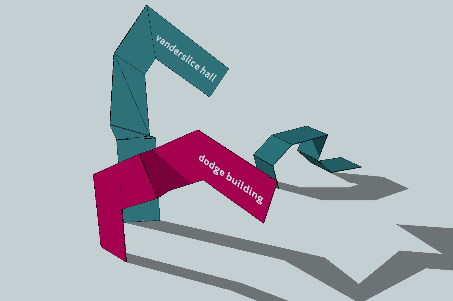
as for the traveling shapes, and the interior signs and directionals, we've been constructing examples of how they work in google sketchup to make sure the forms make dimensional sense, rather than trying to guess and draw them from one angle. again, these are just examples of how these elements will move, rather than molds that they will all mimic. 

an example of a directional hub to tell you which color to follow:


an example of a shape emerging from and re-entering the ground.

a site marker outside a building

an exterior building identifier for vanderslice

an interior wall-mounted directional piece

a bathroom location indicator
a room label


Sunday, February 10, 2013

spatial experience update


our conceptual focus is still on the metaphor of following your own path, illustrating the diversity of experiences on campus through the different colors that guide you to each building. 


where last we left off, the guide-shapes were undefined in terms of shape and material. we had the sense that they would be somehow three dimensional and hollow… we've refined this idea, and decided that the guide-shapes should instead be constructed from 1/4 inch cold press steel, painted in bright colors, with a consistent width of 12 inches. These long sheets would be folded, bent, and wrapped around the environment and seemingly burrow into surfaces only to reappear further along the route, joining with other colors or splitting off to lead you to your destination, as established at well-labeled moments of crossroads. 


our style guide retains futura medium condensed for the kcai logotype but eliminates the crooked "A" to streamline the text. our main typeface for navigation and description is now apex book, with apex bold emphasis. 


neutral information and space, such as street signs, perimeter, and parking, would contain similar shapes that are painted white so as not to confuse the color-coding of the campus buildings. 


the building identifiers themselves would take the appearance of the "end" of the guide-shape, sticking up out of the ground, with a label cut out.


signage inside a building would be made from the same material and the same color as the guide-shapes outside, folded into smaller individual signs to denote directions, bathrooms, and rooms.

Sunday, February 3, 2013

early spatial experience concept

the kcai website says, "do things your way," and "you travel off the beaten path." for our concept, we tried to work with this idea of finding your way, as well as highlighting the diversity that kcai prizes. 

firstly, here is a location plan of where we determined a need for wayfinding/boundary-setting, with several levels of hierarchy and purpose.


as for the visual concept itself, we're envisioning a system of colorful and angled shapes that guide visitors to their destinations while referencing the outline of the core graphic element. each destination would have its own color designation, and these shapes would emerge from the ground or from architecture along the path to confirm that you're on the right track. an interesting visual complexity will emerge along main through-ways where, like downtown highways, several paths use the same route. in these places, there should be an interplay between the colors, so that it's easy to tell when your path either joins with or separates from others.


moments of crossroads, such as entrances, should clearly elucidate each color and in what direction you should start walking to follow its path. we imagine these navigational guides to be harmonious with the traveling shapes, whether they take the form of the traveling shapes emerging, labeled, from the ground, or if they look more like a signpost with smaller color-coded elements to represent them.

materials we've imagined so far for these elements include clear colored plexiglass, opaque colored plastic, or painted metal.