Showing posts with label visual communications ii. Show all posts

Friday, May 13, 2011

sophomore review


(this photo is appalling, but i haven't imported from my camera yet. i'll swap it out when i do.)

my presentation went rather like this:

good morning, everybody. i'm jessi wilson, and i think that design is all about storytelling.

this puts me in a good spot, because i'm a creative writing double major. i'd like to take these few moments to describe my experience and growth as a designer iand communicator through the lens of writing. 

i see there being four main ways i have been utilizing this design/writing relationship, heavyhanded or subtle. literal creative text, emergent narrative, character study, and type as image.

first came first: dot book. a project devised to teach us to tell a story without spelling it all out in words. i ran into immediate brick walls, so what did i do? spelled it all out in words, and then built my project from there. this worked really well for this project because my book is about growing up and family cycles and the story helped me get at the emotional heart of what i wanted my piece to be about in a way that mindmapping wasn't doing. 

i soon realized i could use my writing as more than a crutch, such as during process for the haiku project. i could use my writing to enhance my design! i blogged almost exclusively in haiku. the taxonomy of markmaking that matthew jacobs and i made first semester was heavily inspired by the cyclical nature of our haiku, and the looping animations we were building for it, which i'd like to show real quick. for our taxonomy,  we created a structure of categories not simply out of sets and subsets but along a storyline, and provided with it, a set of haiku i had written myself to work cooperatively with both the structure and function of the book. 

i've also taken opportunities to supplement my designwork with personal wordplay like this in places like my infographics. at this stage in my career, unweighted by provided body copy, i was able to give my information graphics, which detail a collection of facts and stats that new or curious djs might need or enjoy knowing, some extra personality. 

speaking of personality, an aspect of design storytelling I've really been excited about lately is the idea of character building. whether this is the character of my work itself, as in my pop star exhibition, or my roommates and me in my photo colorbook, or even if it's the constructed character of your target audience, giving a designstory a subject can heighten the experience so profoundly. i was able to make my formal decisions for my dj magazine only once i considered the sort of hip, young music fans who might want to become a dj that i considered my target demographic. luckily for my interpretation, the next step in this process was to develop some aspect of this same article for the ipad, and i from what i hear hip, young people are all about the apple technology. 

character development has a lot to do in my mind with the idea of emergence of narrative or information. since beginning the study of semiotics at the start of the year, the way i've conceived of imagemaking has certainly changed. i've gotten excited about the practice of building information around and around a shape until the shape itself becomes clear. my tolkien identity poster is a good example of this because the assignment itself was to use symbols and indexes to convey something that could much more easily but much less descriptively been gleaned from text or direct iconographic references. 

as for emergent narrative, eli brumbaugh and i really played with cross-platform relationships for our 6 degrees project. each moment of the system implies an aspect of a bad situation all on its own, but when everything is seen within the context of the rest of the system, the story of a character (character building!) dousing the globe in careless flammables and setting it alight. this was exciting to me because it represented a real push off from just starting with or even using personal text: it was communicating just as much information and even nuance as a story might, only instantly, and through only images.

finally, here's where it starts getting really crazy: when you take the text out of type, and let your type stand all on its own, as an image. this was a huge part of our typographic campaign and really shook what i had thought possible to do with type. the abstraction of text into just expressive letterforms that can still get across an idea, if you're paying close attention (perhaps the y letterforms of my neuron shape could stand in for the question "why?", favored as it is by both designers and scientists, the characters i had been working with as my audience for the campaign.

at the start of the year, i was clinging to my writing as a crutch, maybe even an  alternative to some amount of process, but by now, i've been exposed to and utilized so many different methods of communication, and witnessed so many different relationships between the writing process and the design process, that i feel empowered to intertwine them now, not because i can't work any other way but simply because i keep getting so excited about all the possible interactions and how both of my disciplines can strengthen one another

thanks!


the ensuing critique was really good and flattering, and gave me a few ways to keep pushing this writing/designing/communicating  dialogue with puns and specificity and lots of layers. also, i got a bonus compliment on craft, which was super exciting.


now i'm a junior! oh my goodness.

Friday, May 6, 2011

the end of viscom two, how did that happen?

wow. end of the line again. i can't believe it.

the last thing i've done to my pop star exhibit is try to unify my halftone popstars with my bokeh/flashbulb backgrounds by adding (guess what!) more halftones. conceptually, this just means that maybe not even the fame itself is real! it's all very illusive.

to review, this is where pop star has been, and eventually, where it has ended up:

step 1


step 2 didn't really show any good change, so on to

step 3, a total jump in imagery.


step 4 (adding a texture!)


 step 5 (de-itunesify!)


and finally, up to this point,
step 6. unification through more halftone dots! and changing computerface into mixerface for the cover.
my final book!


Saturday, April 30, 2011

de-itunesify!

so... the thing about silhouettes of dancing people, especially within the context of current music... the most recent and well known example of that particular solution is apple's ipod commercials. there was some worry that my identity could get mixed up or even infringe-y on that visual system, so i spent an unreasonably long amount of time trying to come up with other treatments to solve that issue to differentiate my work from things that are already out there that are still conceptually tied.

the thing that i ended up with (and i'm actually pretty pleased with) is a simple enough halftone treatment on the people. i was thinking about how from a distance, halftone gradients can look very smooth and shiny and nice but once you get close, they fall apart. similarly, pop music is dressed up to look and sound great from afar but once you really get down to it, it's illusion and trickery!

my compositions stayed pretty similar from the last go-round, i just applied that treatment and worked on my type a little more. here are some updated pieces, for instance.


obviously there's still a lot more tightening down to do, and after today's critique, i need to figure out how to either unify my halftone and my bokeh better, or separate them more clearly for a really punchy contrast, but right now they're just a little too related but not related enough. moving right along!

Friday, April 29, 2011

the first ever pop star in context

one of the criticisms i got on my last set of these images was that the flat vectors just didn't look very... finished. they didn't look complete and considered, more like digital sketches. i experimented with several ways to help rectify this and ultimately, the solution i decided to pursue was the incorporation of textures that harmonized with and echoed the colors they were joining. the images i chose to use as texture are a photographic method called bokeh that distorts and blurs lights into bubbles. i thought this was appropriate as the abstractions of light could be representative of stage lights, or of flashbulbs, both of which surround pop-stars on display.


i made a mistake that a lot of us made, i think, in terms of the web banner: we copied the smithsonian style guide too well, at the expense of nicer design. the fact is, people looking at our portfolios aren't going to know what the smithsonian standard is, but they will be noticing if our web banners just don't look so hot. thus... cater to the latter.


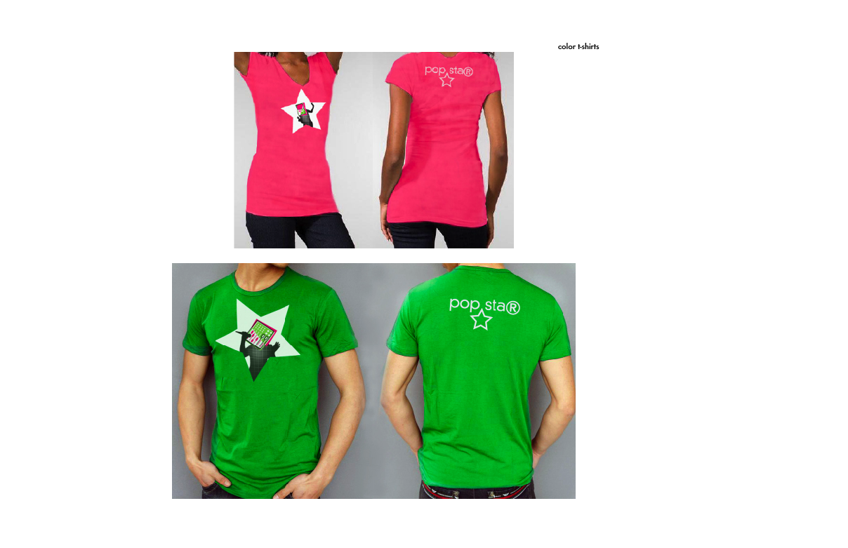
and then, there were t-shirts. t-shirts were my earliest introduction to graphic design, and still one of my favourite media! so. some t-shirts.

Saturday, April 23, 2011

pop star!

faked you out with that analog/digital stuff, huh? i tried that. i also kept working on pop star. it ended up working a lot better. so i went with that!

i'm sure you remember how unfortunate looking my pop star concept when it started. and how much worse it was in the second go-round. feeling like i just didn't even know where to go with it, i asked jamie for some advice on where to start, and one of the things she said was "maybe it isn't a full bleed."

so i started cutting people off their backgrounds, and thought of a spotlight as a potential graphic treatment, which led me to this stop along the way:


once i got there, i thought it might be more interesting to use dynamic silhouettes, which also takes care of the issue of the photographs being too recognizable or not recognizable enough.

then i generated a bunch of synthfaces/mixerfaces/computerfaces and set about doing different things with them!


it turns out that the spotlights, despite being the idea that got me to this place, were not so successful. the type that i used on that set, though, the futura with the star, is something that i am moving forward with (it was my favourite type style!) and i'm going to be working on combining the movement of the slice banners with more of the star cut-out identity. i'm so glad to have gotten this concept out of its rut and back on a track where i can see progress. yaiy!

Wednesday, April 20, 2011

viscom exhibits, bringing you up to date.

here are two rounds of visual systems for smithsonian exhibits! these are the result of all that brainstorming and stuff we were talking about earlier. i left the pirates back in the brainstorming phase, and ended up splitting my mainstream music concept into two different visual ideas, one more about production, and another more about consumption. the concepts at this point were an old vs new look at music technology:


the biography look at the people who set hip hop and dj culture off on its course:


the falsified production of popular music:

and the basically unavoidable consumption of popular music:


from that point i said goodbye to music-for-the-masses, despite its nice use of icon scale, which i tried to recycle later to no particular avail. here was the next step.

i tried to incorporate more scale in victrola to itunes. it looks slightly more like wrapping paper than it did when i started. i need to consider different relationships for my mac and my synth than the old add-ons they currently have, trying to find something with a more beautiful form to go better with the recordplayer.


i swapped out some images for the hip-hop ancestors, and cleaned up the messy icon pattern, electing just one icon to represent their contribution to the culture instead. by the by, if you're wondering, these gents are grand wizard theodore, dj kool herc, and afrika bambaataa, going left-right-down. i tried out two different versions of this, trying out different names/typestyles and icon usage.


for my pop star idea, my classmates encouraged me to look at different processes or outside imagery i could use to reinforce the production methods. i tried out the photoshop interface and magic wand tool to reference the idea of computerized alteration, and then i tried another version that focused more on the industrial manufacturing concept using factories and a conveyor belt. i also tried out a different title to try to use another copyright symbol. none of this worked.


so, to date: my undergroundkings/godfathers are no longer in the running, given that it was more about using the look of that culture than utilizing my own designyvoice. that leaves me with pop stars and the evolution of music tech, both concepts that i love, and both executions that are pretty weak.

being me, i am of course still dragging both of them along for the ride, letting them play chicken to see which one i can get a better idea out of first. which will be applied to real forms, in three iterations, by friday.

wiiiish me luck!

Sunday, April 17, 2011

museum exhibit ketchup, backstory, or whatever you'd like to call it

so about that anchorage & relay idea. i think i've explained it previously, but just in case, here's a super-quickest explanation: anchorage relationships reinforce one another, whereas relay relationships expand one another.

here are my 24 anchorage/relay exercises that sparked the museum exhibit discussions.

first, text anchorage, using my icons and words that reinforce what they are.


next, image anchorage, using my icons and images that reinforce what they are.


now, text relay, which uses my icons and words that aren't directly related, asking the viewer to draw conclusions.


here are some details, because some of those are kind of hard to read.


and lastly, image relay, which takes my icons and pairs them with not-directly-related imagery and asks the viewer to figure out what is being said by the relationship.