Showing posts with label typography ii. Show all posts

Friday, May 13, 2011

sophomore review


(this photo is appalling, but i haven't imported from my camera yet. i'll swap it out when i do.)

my presentation went rather like this:

good morning, everybody. i'm jessi wilson, and i think that design is all about storytelling.

this puts me in a good spot, because i'm a creative writing double major. i'd like to take these few moments to describe my experience and growth as a designer iand communicator through the lens of writing. 

i see there being four main ways i have been utilizing this design/writing relationship, heavyhanded or subtle. literal creative text, emergent narrative, character study, and type as image.

first came first: dot book. a project devised to teach us to tell a story without spelling it all out in words. i ran into immediate brick walls, so what did i do? spelled it all out in words, and then built my project from there. this worked really well for this project because my book is about growing up and family cycles and the story helped me get at the emotional heart of what i wanted my piece to be about in a way that mindmapping wasn't doing. 

i soon realized i could use my writing as more than a crutch, such as during process for the haiku project. i could use my writing to enhance my design! i blogged almost exclusively in haiku. the taxonomy of markmaking that matthew jacobs and i made first semester was heavily inspired by the cyclical nature of our haiku, and the looping animations we were building for it, which i'd like to show real quick. for our taxonomy,  we created a structure of categories not simply out of sets and subsets but along a storyline, and provided with it, a set of haiku i had written myself to work cooperatively with both the structure and function of the book. 

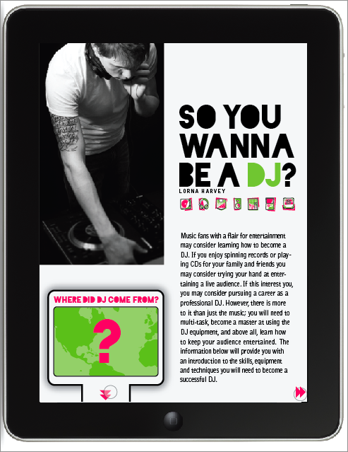
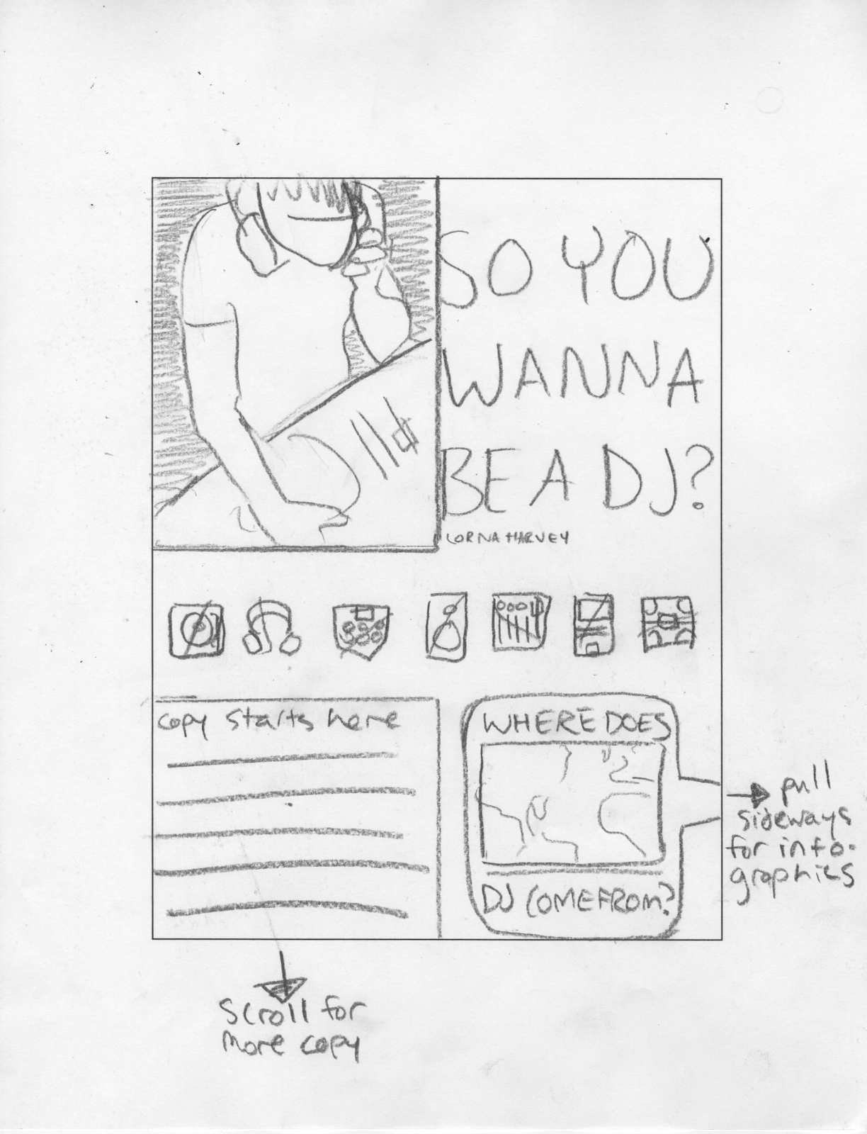
i've also taken opportunities to supplement my designwork with personal wordplay like this in places like my infographics. at this stage in my career, unweighted by provided body copy, i was able to give my information graphics, which detail a collection of facts and stats that new or curious djs might need or enjoy knowing, some extra personality. 

speaking of personality, an aspect of design storytelling I've really been excited about lately is the idea of character building. whether this is the character of my work itself, as in my pop star exhibition, or my roommates and me in my photo colorbook, or even if it's the constructed character of your target audience, giving a designstory a subject can heighten the experience so profoundly. i was able to make my formal decisions for my dj magazine only once i considered the sort of hip, young music fans who might want to become a dj that i considered my target demographic. luckily for my interpretation, the next step in this process was to develop some aspect of this same article for the ipad, and i from what i hear hip, young people are all about the apple technology. 

character development has a lot to do in my mind with the idea of emergence of narrative or information. since beginning the study of semiotics at the start of the year, the way i've conceived of imagemaking has certainly changed. i've gotten excited about the practice of building information around and around a shape until the shape itself becomes clear. my tolkien identity poster is a good example of this because the assignment itself was to use symbols and indexes to convey something that could much more easily but much less descriptively been gleaned from text or direct iconographic references. 

as for emergent narrative, eli brumbaugh and i really played with cross-platform relationships for our 6 degrees project. each moment of the system implies an aspect of a bad situation all on its own, but when everything is seen within the context of the rest of the system, the story of a character (character building!) dousing the globe in careless flammables and setting it alight. this was exciting to me because it represented a real push off from just starting with or even using personal text: it was communicating just as much information and even nuance as a story might, only instantly, and through only images.

finally, here's where it starts getting really crazy: when you take the text out of type, and let your type stand all on its own, as an image. this was a huge part of our typographic campaign and really shook what i had thought possible to do with type. the abstraction of text into just expressive letterforms that can still get across an idea, if you're paying close attention (perhaps the y letterforms of my neuron shape could stand in for the question "why?", favored as it is by both designers and scientists, the characters i had been working with as my audience for the campaign.

at the start of the year, i was clinging to my writing as a crutch, maybe even an  alternative to some amount of process, but by now, i've been exposed to and utilized so many different methods of communication, and witnessed so many different relationships between the writing process and the design process, that i feel empowered to intertwine them now, not because i can't work any other way but simply because i keep getting so excited about all the possible interactions and how both of my disciplines can strengthen one another

thanks!


the ensuing critique was really good and flattering, and gave me a few ways to keep pushing this writing/designing/communicating  dialogue with puns and specificity and lots of layers. also, i got a bonus compliment on craft, which was super exciting.


now i'm a junior! oh my goodness.

Friday, May 6, 2011

the end of type two, how did that happen?

one last post about my dj article! 


for my magazine spreads, i let myself continue to be inspired by my icons and now, my infographics.

 the chunky lines in bright colors come from my rendering of my icons, and the black and white photography adds information and interest without fighting the dominant pink and green. 

i got the three columns directly from my infographics themselves. two of the three infographics i was using already utilized a three column grid that i simply needed to tidy up to work as the backbone of my magazine. 

moving to ipad i was most excited about the opportunity to use my infographics in a more intuitive way, plugging their information in to the point of the article where it is most relevant but without destroying the flow of reading. 

i did this by using not only side-to-side reading, like in a magazine, but also in an up/down format. 

in this way, my magazine would establish an expectation that to go to the sides means to continue reading, while you can "dig deeper" underneath the article to pull up some information. 

when possible, i used interaction as a way to allow the user to reveal or sort information in the order they're interested in, allowing for comparison as well as simply order.


and then, the ipad. you've seen most of these from my earlier blog post, but they are a bit more refined, and i finished the rest of my body copy pages. 


three map interactions: click the two in california, it shows what happened there.


tap the 1 in the timeline and it'll tell you where the first dj event happened, and what it was.


 lastly, click an icon, and all the information relating to it will appear. in critique we discussed maybe revealing different information with the different points of interaction as opposed to the same information but sorted different ways.


the timeline, which is not executed terribly well, but given the context of the rest of my magazine, a pretty admirable shot, starts with all the information displayed, a fact that worried my classmates. as you begin to click on and off the toggle icons on the bottom, the amount of info changes by object.


 here are those brand new body copy screens!


i'll miss you, marty! see you next spring! (wow. that seems so far away.)


now about that sophomore review...

Saturday, April 30, 2011

most of an ipad magazine

for last class, i had fleshed out almost all of my magazine. we spent most of class clicking around in keynote, swearing softly, as we learned about animating interaction in slideshows. (a tremendously useful skill for the future! but only learnable through a lot of trial and a lot of error and just so much clicking.)

so here is the framework for my almost-magazine, the likes of which i have been animating together! i still need to go back in and fix plenty of things, of course, but at least now i know how to make things move around and faux-interact.

this is gonna be an image-heavy blog post. i'm sorry. this doesn't even have the end of my article in it yet... it takes a lot of frames to show how my i-magazine is put together! also, because i can't arrange images in blogger like i would like to, just remember that when you turn pages, you're going side to side and when you pull up on an infographic tab, you get that infographic from below the article.


(you've seen how this part works... but i started using those little skip-track arrows as page nav as well as for infographics)


oh hey full bleed image with a pull-quote... (i said i was gonna try to incorporate that from last round.) he's not going to be page two of my article, though, because i need to establish "go right for more text" before i start to mix it up with a pretty picture.


some text pages! look at 'em go. all these have is page nav interaction, nothing too extraspecial.


here's a nice place where the ipad lets me arrange information a little better than my magazine spreads... the text from these paragraphs relates to two infographics, whereas they don't necessarily relate to the rest of the article. unfortunately in my spreads i just put one of those infographics on the next page, so it was close enough, hopefully, to still relate, being the very next thing you saw, but this gives me the opportunity to use both of them at the same time, since they both talk about the equipment.


i think i'm going to end up taking the interaction out of this because, as much as i like the idea of it, it doesn't really sort the information or add any level of understanding, it's kind of just interactivity for its own sake. so in the future i think you'll just pull the tab and this will come up, all filled in. but as it's shown here, the input and output lists are empty until you drag your finger from a piece of equipment to the mixer, at which point the black line appears and a description of the object shows up under its appropriate heading. the icon shows up as soon as you touch the item but the text doesn't appear until you finish connecting the two.


the map would appear horizontally, telling the user to tip the ipad to its side. i tried to set this up vertically but scale-wise, it just wasn't going to happen, and the interaction insists that you be able to see the whole timeline all at once without scrolling, so this was the best simple solution available. upon opening the timeline, it would be entirely filled in with a row of icons underneath. the icons act as toggle-buttons to display different amounts of information so that you could track the evolution of one object at a time.


if you just click one icon, the others will fade and their information will be removed, leaving you with the history of just one thing. if you touch another icon, it will brighten to full opacity and add its information to the timeline so that you can compare more than one history. 

just gotta finish up the body-copy pages, and then animate it all. also, tighten it all down. also also, acquire an ipad someday maybe because that would be supernifty.

there's more than one way to skin an ipad

after talking to marty about our analog sketches, we started applying them to our digital design elements, "skinning" our ideas with the visual language we wanted our magazine to have. we needed two different skins so i started out with the "tray" idea i first had in my sketches, which i (spoilers!)  ultimately ended up moving forward with. the translucent dots are your fingers! when they show up several at once, they're illustrating several different kinds of interaction. you don't actually have to play ipad chords to turn pages or anything.


the bubble tab tells you that there is an infographic in the space under the article, as well as the kind of information it will contain. the triangle in the corner (later to be refined) tells you the article continues to the right. if you either click the down arrows or scroll, the infographic will slide up into the frame.


the map has three ways to interact with the map data. through map numbers, through timeline numbers, or through icons.


if you click on the big number in the map, it will tell you what happened there. if you click on the small numbers in the timeline, it will react as though you'd clicked that number in the map, letting you see where each event happened in order of when. and lastly, if you click the icons along the bottom, it will bring up all the information relating to that topic all at once, so you can compare where similar events occurred.


my other skin (it contains the same first page->map sequence) used the pink and green bars from my paper magazine as forward (green for go!) and backward (red for... go backward?) as navigational elements. unrelatedly, when i was talking to marty about these, we decide this opener was so handsome that i should try to incorporate a full-bleed photo like this into whatever magazine set i end up using, particularly because i'm working on my whole magazine.


now, because i don't actually have an ipad, i'm not sure if this is a thing that they do? but i was thinking i might be able to use the accelerometer as cue to open the infographic when you tipped the ipad onto its side. 


as for the map interactivity, it's still the same as the other skin. tap things. information. you know the rules.


i was trying out different ways to highlight the information... i kind of tried to use these arrows as a motif in this skin, but they're too visually different from my infographics. like i said, moving onward/upward with the first concept.

i've really been getting a kick out of this stuff. i just wish i knew how ipads worked, kind of... i just don't really have much experience with them (i've used my boyfriend's ipad a few times?).

i was talking to marty about "wouldn't it be awesome if we got a big happy grant to give all the design students ipads!" the conversation then went similar to this: "yes it would."

meanwhile back in typeland!

i just realized that despite plugging away on all this type-ipad work, i hadn't blogged about it in quite a while. so, it's bloggin' time!

we started out by sketching a few possible interactions. i had a really hard time understanding what it meant to pick little interactions without understanding how the rest of the magazine was going to work... so i kind of figured out my system for the whole magazine instead. i scanned my sketches, which i'm posting with my annotations on them, because i feel like that's an interesting piece of process. first, my little sketch of spatial relationships: what scrolls down vs what swipes sideways. here, i have you scrolling down for more body copy and "pulling out a tray" on the right for supplementary features. we decided this might be a problem, however, because most people seemed to feel like turning pages was more natural to receive more article whereas an infographic might be dangling underneath the content for you to scroll down and analyze. so this was where i began with the interactive process.


(let it be known that this is my "i'm trying so hard to write legibly" handwriting.)

Tuesday, April 19, 2011

ipad: the new magazine playground.

tablets and touchscreens are a big part of the future, for sure. when the ipad was first announced, i was among the crowd who was a little quietly disappointed that it wasn't the tablet-style but fully powerful macbook that had been rumored so long ago in the messageboards. but as the ipad has taken hold, and as other tablets join it in the marketplace, i've really begun to understand its niche better. these tablets are not supposed to be heavyweight computers. they're not supposed to be hyperactive, teeny-tiny smartphones. they are a middle-weight something totally different, an intuitive container for all sorts of media, a bridge between reading/watching/listening and physically participating. they open doors to new ways of learning and interacting with information, new ways to explore ideas and experience situations.

there are a lot of super-nifty things that ipad design allows for that nothing else really does right now. a few that i'm excited about are the dimensional aspects (not just 2d, but 3d, and also 4d!), the potential for lateral instead of just linear organization of information, and really deep integration of primary and supplementary information into a single, compelling, personalizable experience.

all layout design deals with two dimensions, given that you're arranging "flat" shapes on a "flat" surface. you can move your elements up/down or left/right, or maybe overlap them to create the illusion of some space... but with the digital surface of the ipad, the third dimension of depth really comes out to play. it's especially fun because we continue to treat the ipad screen for the most part like a flat surface, so when something 3d does happen, it becomes this really exciting, unexpected moment. a good example of this is in advertisements where, instead of a nice hi-res image of a car or a camera, they embed a 3d model to allow you to spin it all around, see every side. there's also a fascinating allowance for time-based (4d) components, even still within the 2d layout, like in time magazine's covers... a video plays under the titles and standards rather than simply a still image, making for an interesting interaction between what we expect from a cover design and what we expect from a film clip.

another interesting possibility is the idea of lateral organization of content rather than page by page linear organization. it looks like lots of ipad magazines are already doing this just in their content order, that you scroll laterally side to side to change topics and scroll deeper down to get the full story, so that the row of opening pages are all equivalent and they occupy locations rather than durations. this makes so much sense and has, in my opinion, always been a thing that's somewhat difficult about magazines as they are.

finally, the most exciting thing of all about ipad design: totally integrated experience. your magazine is no longer a one-way street. advertisements aren't just obstinately there, glaring at you. every moment invites you to participate, to move through the content at your pace, and puts you in charge of the revelation of additional information at your leisure. where previously a mostly a's-mostly b's-mostly c's personality quiz may have been, now you can plug in your own answers and receive the explanation tailored to your input. where previously a single image may have been, now a whole paradigm of images might shift through, one by one, or even a film clip. if a picture is worth a thousand words, image when a short video must be worth! advertisements no longer need you to remember and pursue their products at the mall next week because they can win you over in an interactive experience and then link you to a page to buy the product right then and there while you're still excited about it. hyperlinking, expanding/collapsing footnotes, extra information... without being tied to a static page, the content can stretch out and back up any way it needs to.

anyway. i think this stuff is pretty cool.

Thursday, April 14, 2011

step one of dj magazine spreads!

at this point, i wasn't sure what article i was going to use (i'd found some six or seven, word-counted and politely waiting in my text edit windows). i chose a bio/interview with afrika bambaataa, the guy who made hip-hop happen, and made three spreads with that article, and then very suddenly it dawned on me that that text really didn't allow for very many of my infographics (one, i think, worked well... that was all) and if i used one of my other options, a beginner's how-to for getting started to dj, i could incorporate several.

thusly, for the first day's critique, i had this stuff:


this look lent itself to a rehash with the other article, so i kept up with that. 


and this is, incidentally, what i've been refining as i move forward, largely by giving it some space to breathe just in every direction. (roomier margins, less colorbar, implementation of a lower hangline... you'll see in the next blog post!)

Wednesday, April 6, 2011

final bantjes poster & postcards


marty was pretty pleased with out class's work, all up on the wall, which is awesome, and always a good feeling. she said it was "sophistocated for our level," i think. or something similarly humbleflattering (can i coin that word? it has a nice sound to it.) we unanimously need to work on our secondary information, myself very much included. type is a thing where, i think, the simpler something is, the harder it is to actually succeed at. big names and titles and looks are one thing, but the harmonious typesetting of a few lines of backup info, things that need to be said supplementarily but not noisily, is so so so delicately, precisely difficult! earlier in the project, i would've said that that was just me, but after critique, it appears (to at least some degree) to be everybody. it's like the quote patrick used in his campaign: "everything in typography is a subtlety." and how.

my poster design came pretty far this time. i always knew i was interested in the 'by-hand' aspect in marian's work, and i'm glad i got to use a refined version of that idea in my final. i learned in my critique that i could stand to have the pattern in my corners still even smaller, that it turns into a nice gold texture the smaller it gets, and that the beads are nicer as a surprising up-close reveal. (changes for portfolio, ofcourse)

in class we spent some time talking about "the moral of the story," or "what we learned at school today." (sometimes i think we can get some pretty meaningful things out of charmingly childish sounding exercises like storytime and talking about what we learned. i wish more people realized that.) as a response to erica's heightened understanding of simplicity, i added that sometimes, you just don't want simplicity. and at that point, you have to step up to the designerplate, and wrangle some complexity.

ornament is never problematic if it's controlled. something can be visually busy in places and still clear and legible and clean, provided that the wildness and complexity are reined in with a well devised ruleset.

i also described the realization that i'm continually having that this isn't just school anymore. this is it. the real deal. the thing school has been preparing me for. now is the chance to finally do the things i care about doing in the way i want to do them. i get to mold the things that i love and the aesthetic i want to work within into my work to solve the problems my professors set out for me.

marian bantjes is a good person to learn this lesson from. she dropped out from school, and from the mainstream working world, to make the things that she wanted to make, and in doing that with as much passion as she did, she succeeded in getting noticed by people who wanted her obsessive dedication in their work. she does what she wants, and people appreciate it. so they hire her to do it more. this, it seems, is the way to go about it.

thanks marian! i'm kind of sad she's not coming on the 27th.