Friday, May 6, 2011

the end of viscom two, how did that happen?

wow. end of the line again. i can't believe it.

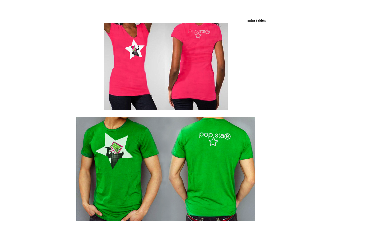
the last thing i've done to my pop star exhibit is try to unify my halftone popstars with my bokeh/flashbulb backgrounds by adding (guess what!) more halftones. conceptually, this just means that maybe not even the fame itself is real! it's all very illusive.

to review, this is where pop star has been, and eventually, where it has ended up:

step 1


step 2 didn't really show any good change, so on to

step 3, a total jump in imagery.


step 4 (adding a texture!)


 step 5 (de-itunesify!)


and finally, up to this point,
step 6. unification through more halftone dots! and changing computerface into mixerface for the cover.
my final book!


the end of type two, how did that happen?

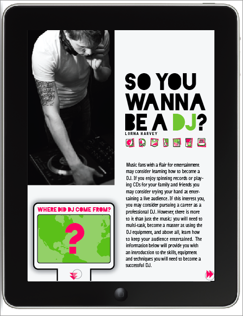
one last post about my dj article! 


for my magazine spreads, i let myself continue to be inspired by my icons and now, my infographics.

 the chunky lines in bright colors come from my rendering of my icons, and the black and white photography adds information and interest without fighting the dominant pink and green. 

i got the three columns directly from my infographics themselves. two of the three infographics i was using already utilized a three column grid that i simply needed to tidy up to work as the backbone of my magazine. 

moving to ipad i was most excited about the opportunity to use my infographics in a more intuitive way, plugging their information in to the point of the article where it is most relevant but without destroying the flow of reading. 

i did this by using not only side-to-side reading, like in a magazine, but also in an up/down format. 

in this way, my magazine would establish an expectation that to go to the sides means to continue reading, while you can "dig deeper" underneath the article to pull up some information. 

when possible, i used interaction as a way to allow the user to reveal or sort information in the order they're interested in, allowing for comparison as well as simply order.


and then, the ipad. you've seen most of these from my earlier blog post, but they are a bit more refined, and i finished the rest of my body copy pages. 


three map interactions: click the two in california, it shows what happened there.


tap the 1 in the timeline and it'll tell you where the first dj event happened, and what it was.


 lastly, click an icon, and all the information relating to it will appear. in critique we discussed maybe revealing different information with the different points of interaction as opposed to the same information but sorted different ways.


the timeline, which is not executed terribly well, but given the context of the rest of my magazine, a pretty admirable shot, starts with all the information displayed, a fact that worried my classmates. as you begin to click on and off the toggle icons on the bottom, the amount of info changes by object.


 here are those brand new body copy screens!


i'll miss you, marty! see you next spring! (wow. that seems so far away.)


now about that sophomore review...

Saturday, April 30, 2011

6 degrees

there's a big ol' post over at eli's blog about everything we've been doing for image class and our 6 degrees could change the world partner project!


^ you can click that to go to his blog post

most of an ipad magazine

for last class, i had fleshed out almost all of my magazine. we spent most of class clicking around in keynote, swearing softly, as we learned about animating interaction in slideshows. (a tremendously useful skill for the future! but only learnable through a lot of trial and a lot of error and just so much clicking.)

so here is the framework for my almost-magazine, the likes of which i have been animating together! i still need to go back in and fix plenty of things, of course, but at least now i know how to make things move around and faux-interact.

this is gonna be an image-heavy blog post. i'm sorry. this doesn't even have the end of my article in it yet... it takes a lot of frames to show how my i-magazine is put together! also, because i can't arrange images in blogger like i would like to, just remember that when you turn pages, you're going side to side and when you pull up on an infographic tab, you get that infographic from below the article.


(you've seen how this part works... but i started using those little skip-track arrows as page nav as well as for infographics)


oh hey full bleed image with a pull-quote... (i said i was gonna try to incorporate that from last round.) he's not going to be page two of my article, though, because i need to establish "go right for more text" before i start to mix it up with a pretty picture.


some text pages! look at 'em go. all these have is page nav interaction, nothing too extraspecial.


here's a nice place where the ipad lets me arrange information a little better than my magazine spreads... the text from these paragraphs relates to two infographics, whereas they don't necessarily relate to the rest of the article. unfortunately in my spreads i just put one of those infographics on the next page, so it was close enough, hopefully, to still relate, being the very next thing you saw, but this gives me the opportunity to use both of them at the same time, since they both talk about the equipment.


i think i'm going to end up taking the interaction out of this because, as much as i like the idea of it, it doesn't really sort the information or add any level of understanding, it's kind of just interactivity for its own sake. so in the future i think you'll just pull the tab and this will come up, all filled in. but as it's shown here, the input and output lists are empty until you drag your finger from a piece of equipment to the mixer, at which point the black line appears and a description of the object shows up under its appropriate heading. the icon shows up as soon as you touch the item but the text doesn't appear until you finish connecting the two.


the map would appear horizontally, telling the user to tip the ipad to its side. i tried to set this up vertically but scale-wise, it just wasn't going to happen, and the interaction insists that you be able to see the whole timeline all at once without scrolling, so this was the best simple solution available. upon opening the timeline, it would be entirely filled in with a row of icons underneath. the icons act as toggle-buttons to display different amounts of information so that you could track the evolution of one object at a time.


if you just click one icon, the others will fade and their information will be removed, leaving you with the history of just one thing. if you touch another icon, it will brighten to full opacity and add its information to the timeline so that you can compare more than one history. 

just gotta finish up the body-copy pages, and then animate it all. also, tighten it all down. also also, acquire an ipad someday maybe because that would be supernifty.

there's more than one way to skin an ipad

after talking to marty about our analog sketches, we started applying them to our digital design elements, "skinning" our ideas with the visual language we wanted our magazine to have. we needed two different skins so i started out with the "tray" idea i first had in my sketches, which i (spoilers!)  ultimately ended up moving forward with. the translucent dots are your fingers! when they show up several at once, they're illustrating several different kinds of interaction. you don't actually have to play ipad chords to turn pages or anything.


the bubble tab tells you that there is an infographic in the space under the article, as well as the kind of information it will contain. the triangle in the corner (later to be refined) tells you the article continues to the right. if you either click the down arrows or scroll, the infographic will slide up into the frame.


the map has three ways to interact with the map data. through map numbers, through timeline numbers, or through icons.


if you click on the big number in the map, it will tell you what happened there. if you click on the small numbers in the timeline, it will react as though you'd clicked that number in the map, letting you see where each event happened in order of when. and lastly, if you click the icons along the bottom, it will bring up all the information relating to that topic all at once, so you can compare where similar events occurred.


my other skin (it contains the same first page->map sequence) used the pink and green bars from my paper magazine as forward (green for go!) and backward (red for... go backward?) as navigational elements. unrelatedly, when i was talking to marty about these, we decide this opener was so handsome that i should try to incorporate a full-bleed photo like this into whatever magazine set i end up using, particularly because i'm working on my whole magazine.


now, because i don't actually have an ipad, i'm not sure if this is a thing that they do? but i was thinking i might be able to use the accelerometer as cue to open the infographic when you tipped the ipad onto its side. 


as for the map interactivity, it's still the same as the other skin. tap things. information. you know the rules.


i was trying out different ways to highlight the information... i kind of tried to use these arrows as a motif in this skin, but they're too visually different from my infographics. like i said, moving onward/upward with the first concept.

i've really been getting a kick out of this stuff. i just wish i knew how ipads worked, kind of... i just don't really have much experience with them (i've used my boyfriend's ipad a few times?).

i was talking to marty about "wouldn't it be awesome if we got a big happy grant to give all the design students ipads!" the conversation then went similar to this: "yes it would."