on monday we had went through a "poverty simulation" wherein we divided into family units and roleplayed a "month" in their lives. surrounding the perimeter of epperson auditorium, our location, were tables, staffed by the volunteers who put on the simulation, representing the various businesses and services we would be interacting with. each week was fifteen minutes long, and those who worked full time had to spend eight minutes at their "employer" while school-aged children sat at school and those who didn't work attempted to run their errands, spending "transportation passes" to get to and from every stop in the short amount of time they had. occasionally it was even necessary for the "children" to try to take care of errands such as bill-paying or grocery-shopping or occasionally even pawning. this experience was, not unexpectedly, extremely stressful and frustrating, although the imagery of ryan (my professor), ivan, and jumper as my mother, father, and grandmother, respectively, did prove amusing.
after this experience, we were told to consider moments of communication breakdown, or dysfunction, and consider a way that, as designers, we might be able to help. the smaller and more specific, i think, the better.
i'll be perfectly honest: this project makes me extremely nervous. my own modest upbringing aside, the idea of us, as young, lucky students, looking poverty in the face after a two hour "simulation" and deeming ourselves suitable to fix it, or even some part of it, turns my stomach a bit. it seems presumptuous to me, and demeaning to real people who've lived their lives, maybe struggling for generations, that we could just pretend to be them for a few hours and then step in to help them out.
soapbox aside, a project is a project, and it is our responsibility to convert the expectations of the program into something that we personally can agree with, and then work from there. so my josh (my partner) and i decided to work on proposals that could be valuable to people of all income levels rather than targeting specifically the impoverished.
we have three proposals, which i will simplify considerably for blog purposes.
1. on transportation: a visual campaign, based on infographics and calculations, that helps people decide what the most efficient and responsible mode of transportation is given a circumstance, taking into account not just money but also time, safety, reliability, etc. for instance: if i need to get across town by 5pm, and i only have $x, is it more efficient to spend the money and buy gas, or bus or cab fare, or is it more efficient to spend the extra time to walk or bike and save the money?
2. on the frustration of waiting rooms, and political apathy: a two part idea, half of which being about providing a distraction from the blank white walls and quiet rage of service office waiting rooms, and half of which being about how difficult it is to educate ourselves about local/regional politics and have any real say in the political goings-on that affect us, whether directly or indirectly. it could work like this: a board or visual of some kind within the waiting room that explained the bills up for vote within the next month or so, and a station to facilitate writing letters to the politicians that will be voting, including information on the politicians and a pre-arranged delivery method. (while i really like this idea, i'm thinking that it might be less useful for this project and could instead be more useful for something else. so i'm gonna stash it.)
and
3. on the importance of teaching children age-appropriate lessons about finance and bookkeeping: a family friendly set of workbooks that could be provided either through census data to households with children, or distributed by schools that teach basic lessons about money and budgeting with a twofold hope that a) the children can become more immediately helpful in the short term by becoming part of the family team for keeping track of finances and b) that the gradual exposure to budgeting and bookkeeping will lessen the shock of when they grow up and suddenly are expected to take care of those things themselves.
this last option is both the one that josh and i were most invested in, and also seemed to get the best response from the class in critique today. so i think that's probably where we're gonna go!

Wednesday, November 2, 2011

communication model
our current work in visual language has begun with a reconceptualization of a basic communication model. a communication model is a visual diagram or schematic to help understand the structure of the flow of information between communicators. a basic, simple model might account for two communicators, their message, the context in which they experience the message, the noise that obstructs the message on its path, the channel through which the message is transmitted, and the feedback about the message once it has been received. this, however, does not account for multiple communicators, or multiple channels, or any number of other considerations that must be made, particularly in our modern times, such as a conversion of signal that translates a message across channels during its transmission.
this is my updated communication model.
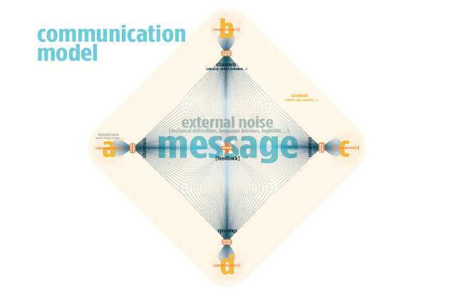
this is my updated communication model.

occupy kc logo build
if the rock you've been living under still hasn't heard, there's a movement going on the united states, and even internationally, called and in support of "occupy wall street." in super-duper quick, design-blog-friendly terms, it's about how money works in the states and where it goes. more specifically, occupy is protesting economic inequality in the united states, corporate personhood, the explosively widening gap between the have-way-too-muches and the haven't-quite-enough-to-get-bys, and the role that cash plays in our ostensible democracy. (which is to say, it plays one. which is the problem.) the rallying cry of the occupy movement is very simple: the 99%, the overwhelming majority, have been taken advantage of for too long by the 1%, whose hold on the money in our economy keeps growing and growing and making it more and more impossible to ever reverse that inertia.
for more local info, or to get involved, may i please direct you to occupy kc's website, or for a bigger look at the movement overall, there is occupy together.
in any event, in our narrative in sound & motion course, tyler has given us the option to, rather than choosing a branding/identity project for which to create a motion logo-build, work with the occupy kansas city group identity.
we are creating 5 second motion graphic pieces to reflect the identity of the business/group of our choosing. my first four concepts, in extremely loose sketch form, looked like this.
wherein a chorus of we-s build together to form the 99%.


wherein the hand symbols of "stop", "peace", and "protest" represent occupy.


for more local info, or to get involved, may i please direct you to occupy kc's website, or for a bigger look at the movement overall, there is occupy together.
in any event, in our narrative in sound & motion course, tyler has given us the option to, rather than choosing a branding/identity project for which to create a motion logo-build, work with the occupy kansas city group identity.
we are creating 5 second motion graphic pieces to reflect the identity of the business/group of our choosing. my first four concepts, in extremely loose sketch form, looked like this.
wherein a chorus of we-s build together to form the 99%.

wherein tiny occupiers occupy kc, overtake it, and then liftoff.

wherein the hand symbols of "stop", "peace", and "protest" represent occupy.

and wherein a line of letters spreads defensively across the screen to represent resistance.

i ended up moving forward with the first idea, the we-chorus. my revised storyboard looks like this.

Monday, October 24, 2011
dare to be square!
let's be honest... at least half of us came to art school just so we wouldn't ever have to take another math. am-i-rite-guys?
but... what if math could be a little more fun? or at least, branded so adorably that you couldn't help but smile at it a little bit, and maybe even have a brightened outlook on the matter from that point on?
...this!


packaging process
first ever digital things, when both catfood and mathkit were running:


math kit was the winner! i just couldn't get into logos cat treats. no offense, cats.
the next set are the pieces i printed and cut out to mock up my plastic kit holder.


still, i was concerned about that ugly plasticky thing that was my original package structure. it was in pretty poor shape even when i bought it in the first place, and it wasn't looking any better for the process so far. it certainly wouldn't be fair for my craft grade to go down because of the shoddy craft of my package being out of my hands, right? so naturally i did a quick total overhaul of my structural design, through trial and error and rapid prototyping of paper models. which suddenly gave me several new surfaces to design, rather than front and back alone.
the pages i printed to construct my new trifold package looked rather like these:


with the last one being folded up into boxes along the interior panels to hold the tools.
it may not be tremendously practical in terms of presence in store or in terms of fast production (okay, so it's not very practical...) but i do think it turns out quite handsomely and is not necessarily any easier to steal from than the original package i had purchased from target myself.
Friday, October 21, 2011
union station interactive timeline
over the course of this project, erika and i have learned a lot about being flexible, about the plasticity of concepts and the occasional necessity to gracefully scrap a great deal of research in favor of simpler models.
in terms of new knowledge acquired, i think i (eventually) got a better handle on what narrative means within the framework of graphic design. those very basic definitions of narrative and story from the start of class made slightly more sense now in terms of a literal, visual story, than they did through kinetic type. we've learned about editing, transitions, pacing, and structure from cinema, and had to consider the levels of order and complexity in cinematic storytelling, from the mise-en-scene of momentmaking, to the temporal and narrative structures, arranging events in space and time within their own context and also within the context of the viewer.
i also learned what the different stages of wireframing are, from skeletal all the way to pretty designed screens, and, of course, i'm always learning more about the ins and outs of the processes of making, including trying hard to grasp how to succesfully move an afx project from computer to computer and designer to designer without forcing it to populate with color-bars like a dead tv channel.
we also learned just a great deal about the sociopolitical & economic climate of kansas city in the 1990s, including the carrying-ons of one clay chastain, whose insistence for light rail has still not waned.
here's the storyboard for the linear narrative of the penny. obviously we deviated a smidge to make things look nicer digitally than we had anticipated but other than that, we followed pretty faithfully.

in terms of new knowledge acquired, i think i (eventually) got a better handle on what narrative means within the framework of graphic design. those very basic definitions of narrative and story from the start of class made slightly more sense now in terms of a literal, visual story, than they did through kinetic type. we've learned about editing, transitions, pacing, and structure from cinema, and had to consider the levels of order and complexity in cinematic storytelling, from the mise-en-scene of momentmaking, to the temporal and narrative structures, arranging events in space and time within their own context and also within the context of the viewer.
i also learned what the different stages of wireframing are, from skeletal all the way to pretty designed screens, and, of course, i'm always learning more about the ins and outs of the processes of making, including trying hard to grasp how to succesfully move an afx project from computer to computer and designer to designer without forcing it to populate with color-bars like a dead tv channel.
we also learned just a great deal about the sociopolitical & economic climate of kansas city in the 1990s, including the carrying-ons of one clay chastain, whose insistence for light rail has still not waned.
here's the storyboard for the linear narrative of the penny. obviously we deviated a smidge to make things look nicer digitally than we had anticipated but other than that, we followed pretty faithfully.

Sunday, October 9, 2011
koenig initial and revised grids
friday was one of those pleasant days when a professor reconsiders the schedule and gives you more information and more time to think before moving on. for which i am grateful. kidwell gave us another demonstration on page layouts and grid structures and ratios etc (and i got all excited about fibonacci, like i always do) and then, thankfully, gave us another shot to redevelop our grids. thankfully because here was attempt uno:


to quote kidwell, although not necessarily about this: "eeehh."


here is grid and implementation number two. much less painful looking. in my mind. i hope.
Subscribe to:
Posts (Atom)