Saturday, April 30, 2011

6 degrees

there's a big ol' post over at eli's blog about everything we've been doing for image class and our 6 degrees could change the world partner project!


^ you can click that to go to his blog post

most of an ipad magazine

for last class, i had fleshed out almost all of my magazine. we spent most of class clicking around in keynote, swearing softly, as we learned about animating interaction in slideshows. (a tremendously useful skill for the future! but only learnable through a lot of trial and a lot of error and just so much clicking.)

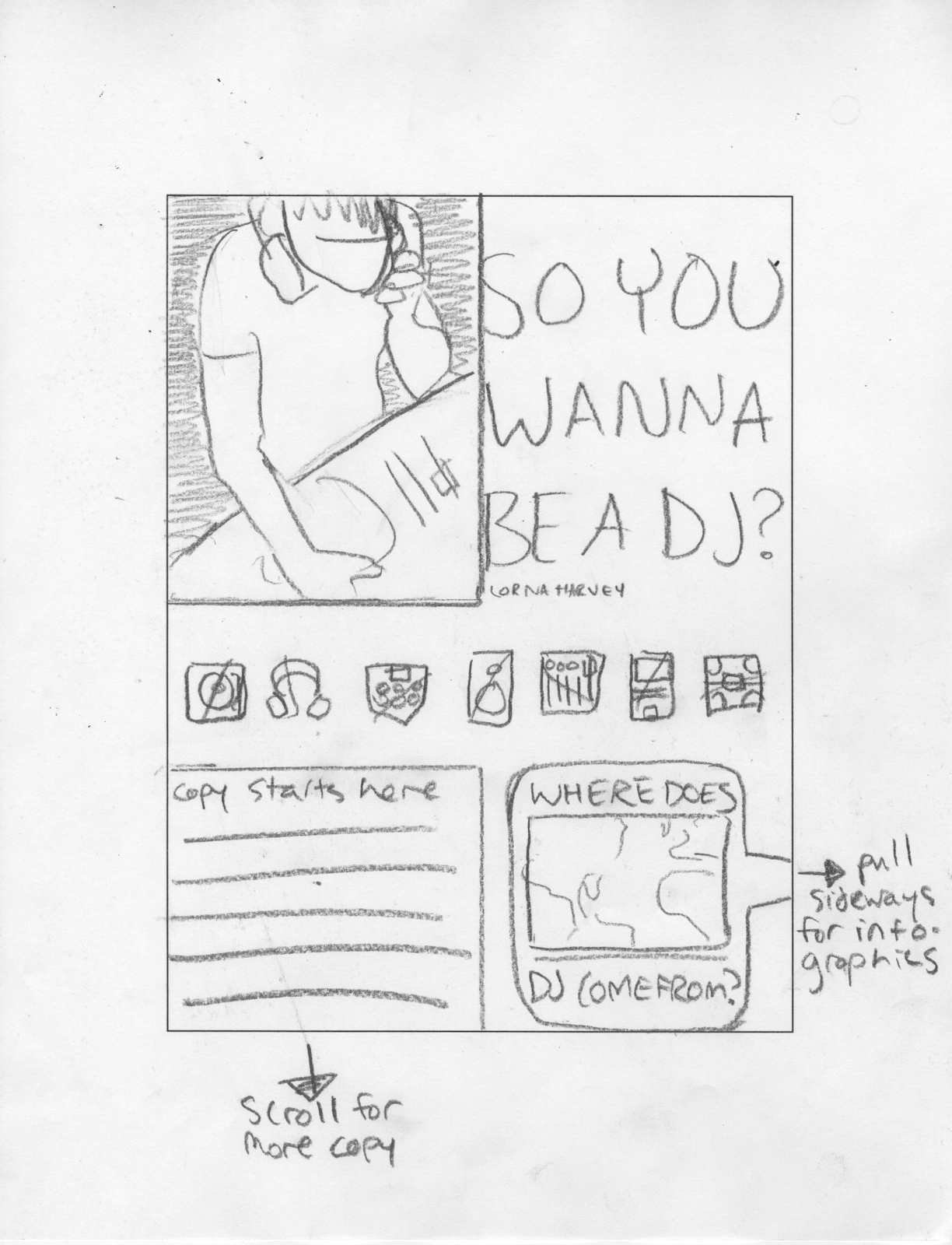
so here is the framework for my almost-magazine, the likes of which i have been animating together! i still need to go back in and fix plenty of things, of course, but at least now i know how to make things move around and faux-interact.

this is gonna be an image-heavy blog post. i'm sorry. this doesn't even have the end of my article in it yet... it takes a lot of frames to show how my i-magazine is put together! also, because i can't arrange images in blogger like i would like to, just remember that when you turn pages, you're going side to side and when you pull up on an infographic tab, you get that infographic from below the article.


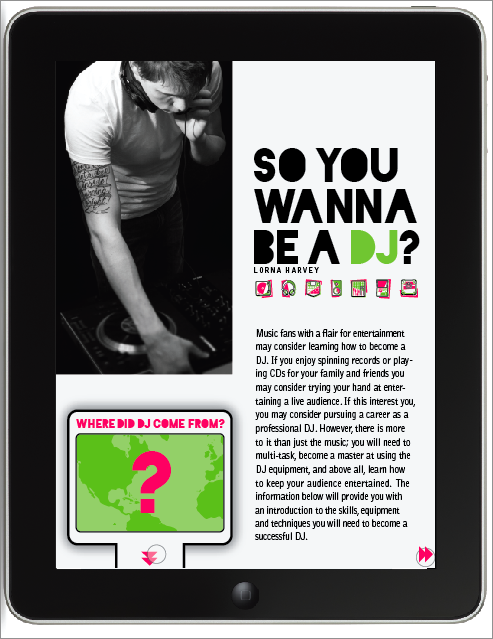
(you've seen how this part works... but i started using those little skip-track arrows as page nav as well as for infographics)


oh hey full bleed image with a pull-quote... (i said i was gonna try to incorporate that from last round.) he's not going to be page two of my article, though, because i need to establish "go right for more text" before i start to mix it up with a pretty picture.


some text pages! look at 'em go. all these have is page nav interaction, nothing too extraspecial.


here's a nice place where the ipad lets me arrange information a little better than my magazine spreads... the text from these paragraphs relates to two infographics, whereas they don't necessarily relate to the rest of the article. unfortunately in my spreads i just put one of those infographics on the next page, so it was close enough, hopefully, to still relate, being the very next thing you saw, but this gives me the opportunity to use both of them at the same time, since they both talk about the equipment.


i think i'm going to end up taking the interaction out of this because, as much as i like the idea of it, it doesn't really sort the information or add any level of understanding, it's kind of just interactivity for its own sake. so in the future i think you'll just pull the tab and this will come up, all filled in. but as it's shown here, the input and output lists are empty until you drag your finger from a piece of equipment to the mixer, at which point the black line appears and a description of the object shows up under its appropriate heading. the icon shows up as soon as you touch the item but the text doesn't appear until you finish connecting the two.


the map would appear horizontally, telling the user to tip the ipad to its side. i tried to set this up vertically but scale-wise, it just wasn't going to happen, and the interaction insists that you be able to see the whole timeline all at once without scrolling, so this was the best simple solution available. upon opening the timeline, it would be entirely filled in with a row of icons underneath. the icons act as toggle-buttons to display different amounts of information so that you could track the evolution of one object at a time.


if you just click one icon, the others will fade and their information will be removed, leaving you with the history of just one thing. if you touch another icon, it will brighten to full opacity and add its information to the timeline so that you can compare more than one history. 

just gotta finish up the body-copy pages, and then animate it all. also, tighten it all down. also also, acquire an ipad someday maybe because that would be supernifty.

there's more than one way to skin an ipad

after talking to marty about our analog sketches, we started applying them to our digital design elements, "skinning" our ideas with the visual language we wanted our magazine to have. we needed two different skins so i started out with the "tray" idea i first had in my sketches, which i (spoilers!)  ultimately ended up moving forward with. the translucent dots are your fingers! when they show up several at once, they're illustrating several different kinds of interaction. you don't actually have to play ipad chords to turn pages or anything.


the bubble tab tells you that there is an infographic in the space under the article, as well as the kind of information it will contain. the triangle in the corner (later to be refined) tells you the article continues to the right. if you either click the down arrows or scroll, the infographic will slide up into the frame.


the map has three ways to interact with the map data. through map numbers, through timeline numbers, or through icons.


if you click on the big number in the map, it will tell you what happened there. if you click on the small numbers in the timeline, it will react as though you'd clicked that number in the map, letting you see where each event happened in order of when. and lastly, if you click the icons along the bottom, it will bring up all the information relating to that topic all at once, so you can compare where similar events occurred.


my other skin (it contains the same first page->map sequence) used the pink and green bars from my paper magazine as forward (green for go!) and backward (red for... go backward?) as navigational elements. unrelatedly, when i was talking to marty about these, we decide this opener was so handsome that i should try to incorporate a full-bleed photo like this into whatever magazine set i end up using, particularly because i'm working on my whole magazine.


now, because i don't actually have an ipad, i'm not sure if this is a thing that they do? but i was thinking i might be able to use the accelerometer as cue to open the infographic when you tipped the ipad onto its side. 


as for the map interactivity, it's still the same as the other skin. tap things. information. you know the rules.


i was trying out different ways to highlight the information... i kind of tried to use these arrows as a motif in this skin, but they're too visually different from my infographics. like i said, moving onward/upward with the first concept.

i've really been getting a kick out of this stuff. i just wish i knew how ipads worked, kind of... i just don't really have much experience with them (i've used my boyfriend's ipad a few times?).

i was talking to marty about "wouldn't it be awesome if we got a big happy grant to give all the design students ipads!" the conversation then went similar to this: "yes it would."

meanwhile back in typeland!

i just realized that despite plugging away on all this type-ipad work, i hadn't blogged about it in quite a while. so, it's bloggin' time!

we started out by sketching a few possible interactions. i had a really hard time understanding what it meant to pick little interactions without understanding how the rest of the magazine was going to work... so i kind of figured out my system for the whole magazine instead. i scanned my sketches, which i'm posting with my annotations on them, because i feel like that's an interesting piece of process. first, my little sketch of spatial relationships: what scrolls down vs what swipes sideways. here, i have you scrolling down for more body copy and "pulling out a tray" on the right for supplementary features. we decided this might be a problem, however, because most people seemed to feel like turning pages was more natural to receive more article whereas an infographic might be dangling underneath the content for you to scroll down and analyze. so this was where i began with the interactive process.


(let it be known that this is my "i'm trying so hard to write legibly" handwriting.)

de-itunesify!

so... the thing about silhouettes of dancing people, especially within the context of current music... the most recent and well known example of that particular solution is apple's ipod commercials. there was some worry that my identity could get mixed up or even infringe-y on that visual system, so i spent an unreasonably long amount of time trying to come up with other treatments to solve that issue to differentiate my work from things that are already out there that are still conceptually tied.

the thing that i ended up with (and i'm actually pretty pleased with) is a simple enough halftone treatment on the people. i was thinking about how from a distance, halftone gradients can look very smooth and shiny and nice but once you get close, they fall apart. similarly, pop music is dressed up to look and sound great from afar but once you really get down to it, it's illusion and trickery!

my compositions stayed pretty similar from the last go-round, i just applied that treatment and worked on my type a little more. here are some updated pieces, for instance.


obviously there's still a lot more tightening down to do, and after today's critique, i need to figure out how to either unify my halftone and my bokeh better, or separate them more clearly for a really punchy contrast, but right now they're just a little too related but not related enough. moving right along!

Friday, April 29, 2011

the first ever pop star in context

one of the criticisms i got on my last set of these images was that the flat vectors just didn't look very... finished. they didn't look complete and considered, more like digital sketches. i experimented with several ways to help rectify this and ultimately, the solution i decided to pursue was the incorporation of textures that harmonized with and echoed the colors they were joining. the images i chose to use as texture are a photographic method called bokeh that distorts and blurs lights into bubbles. i thought this was appropriate as the abstractions of light could be representative of stage lights, or of flashbulbs, both of which surround pop-stars on display.


i made a mistake that a lot of us made, i think, in terms of the web banner: we copied the smithsonian style guide too well, at the expense of nicer design. the fact is, people looking at our portfolios aren't going to know what the smithsonian standard is, but they will be noticing if our web banners just don't look so hot. thus... cater to the latter.


and then, there were t-shirts. t-shirts were my earliest introduction to graphic design, and still one of my favourite media! so. some t-shirts.

Sunday, April 24, 2011

another opinion survey! man, i dunno what'll happen if i ever have to make my own decisions.

thoughts?


just to make it more confusing, here are things i am trying not to invoke, but can't stop thinking about!


they both use spiky, tighter stars, though. mine's kinda puffy. i think that helps it not look similar. what do you think?