through this project, ("a lyrical anthology...") i sought to find a new method for analyzing gertrude stein's tender buttons by charting her syntactical structures. this book is a musical score of 10 poems, generated through the intentional derailment of the flow of her text. the melodic nature of her poetry is revealed through her refrain-like repetition of sentence structures, both inside single poems and across all of her text. acting towards the text as a conductor might the orchestra, i chose to call out hierarchically words and phrases from within the pieces that, when read across the duration of the book, begin to construct their own poem. it was my intention that the experience of retrieving the book be a reference to old fashioned (victorian) music boxes, from which a rudimentary instrument could bring out a beautiful tune. ideally, when presented with the box-experience and the typographic compositions in conjunction, the reader will be unable to read the text without assigning some semblance of pitch to each word, given their height on the page. in this music box, the only limit of the rudimentary instrument is our own imagination.
Friday, September 23, 2011
[jessi] language
tender buttons process
because my type compositions were set fairly early on, i had plenty of time to experiment with my cover imagery. my first try looked a little something like this:
but kidwell encouraged me to try to incorporate some imagery in addition to the ornament i had been making, so these were some of my attempts:
all of this, it seemed, was a little too much. too heavyhanded. we had a lot of talks about how to reference the victorian music box experience without trying so hard to recreate it, that delicate line it's necessary to walk to be a contemporary designer alluding to old things. ultimately, i reigned my cover way, way back to a single piece of ornament in the center, particularly because my box's shape is going to be ornamental enough. which leads me to:
the amazing router/plotter machine that allowed me to assemble my box! all i had to do was compose in vector form the shapes i needed cut, and decide how, exactly, the cuts/levels that belong in each of the shapes.
my vector layout looked like this:
i took this file into the woodshop and john riley opened it in the router's program. we spent probably an hour going through each shape and telling the machine the depths and kinds of cuts it needed to make. once we finally started, we still had to stop and revise the toolpath probably a half-dozen times before we finally got it right. only lost one piece due to user error! (that's why i had the pieces to build two double-high boxes: just. in. case.)
Wednesday, September 21, 2011
peter nero: second round of digital nero
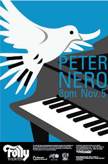
these are the next set of refined or expanded compositions! i cleaned up my piano keys in both cases: in the rotated piano by adding more and spacing them more accurately, and in the piano birds, i cleaned up the gaps between the keys to make them more consistent. i also experimented with cropping and the amount of birds.
peter nero process: first digital comps.
from my refined sketch phase, you might recall i was taking some piano birds, some camouflaged piano hands, and some rotational symmetry into the next step, which was digital. here's what came out:
these compositions seemed to get more potent the less and less they contained. once i got down to the single bird and the zoomed in piano keys on blue, the composition seemed pretty strong. this was my primary new direction for the next digital set, soon to follow.
we decided these pianos were a bit too sparse and simple and that i needed to add detail if i were to move one forward. the angled piano and vertically italicized type was the pick out of these two.
guest critic chuck haddix had been interested in my piano player silhouette so i tried that out, both highlighting the rotation and also downplaying it. both of these got cut.
these are, unfortunately, just photoshop mocks of my plans for this concept. the reason for this being i did not have easy access to a piano, and i believe it would be a hard sell to get somebody to let me paint some hands and then stage the photos, particularly if i hadn't yet tried the method to practice. i had begun winning permissions to photo a piano, but this concept didn't make it through either. the idea became not enough about becoming one with the keys and too much about having ghost hands.
these compositions seemed to get more potent the less and less they contained. once i got down to the single bird and the zoomed in piano keys on blue, the composition seemed pretty strong. this was my primary new direction for the next digital set, soon to follow.
Subscribe to:
Comments (Atom)


