one last post about my dj article!
for my magazine spreads, i let myself continue to be inspired by my icons and now, my infographics.
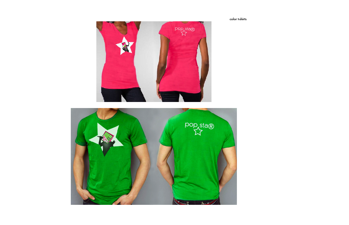
the chunky lines in bright colors come from my rendering of my icons, and the black and white photography adds information and interest without fighting the dominant pink and green.
i got the three columns directly from my infographics themselves. two of the three infographics i was using already utilized a three column grid that i simply needed to tidy up to work as the backbone of my magazine.
moving to ipad i was most excited about the opportunity to use my infographics in a more intuitive way, plugging their information in to the point of the article where it is most relevant but without destroying the flow of reading.
i did this by using not only side-to-side reading, like in a magazine, but also in an up/down format.
in this way, my magazine would establish an expectation that to go to the sides means to continue reading, while you can "dig deeper" underneath the article to pull up some information.
when possible, i used interaction as a way to allow the user to reveal or sort information in the order they're interested in, allowing for comparison as well as simply order.
and then, the ipad. you've seen most of these from my earlier blog post, but they are a bit more refined, and i finished the rest of my body copy pages.
three map interactions: click the two in california, it shows what happened there.
tap the 1 in the timeline and it'll tell you where the first dj event happened, and what it was.
lastly, click an icon, and all the information relating to it will appear. in critique we discussed maybe revealing different information with the different points of interaction as opposed to the same information but sorted different ways.
the timeline, which is not executed terribly well, but given the context of the rest of my magazine, a pretty admirable shot, starts with all the information displayed, a fact that worried my classmates. as you begin to click on and off the toggle icons on the bottom, the amount of info changes by object.
here are those brand new body copy screens!
i'll miss you, marty! see you next spring! (wow. that seems so far away.)
now about that sophomore review...