okay, probably not a fight to the death. it is, however, a constant, never ending war in the heart of every designer, for this project or that project or this piece or that within one bigger thing.
first some preliminary getting-things-straight, directly from my design education without even plagiarizing anything, so it's like a pop quiz i'm giving myself!:
raster, aka bitmap: very simply, a map of bits. built out of rectangular grids of tiny pixels, bitmaps generate curves by staggering such tiny little square things in such particular shapes and tints that by the time you zoom out to a viewing distance, it looks round. things that have horizontal or vertical edges look great, regardless. they are especially good for blending and shading, getting very smooth interactions between colors or tones. photographs are necessarily raster images. they are scaleable down, but not up except for maybe within a very small window before you start seeing all the pixels one by one and the illusion falls apart.
vector: made out of math! the exciting point of vector objects is that they are infinitely scaleable. rather than being yea-many pixels down or across, they are governed by equations that can be replicated proportionally no matter to what size you're trying to scale it. vectors are perfectly smooth and clean, with no blurry edges, no matter how closely you zoom in. they make flat, 2-d shapes with crisp lines, but are difficult to blend across or together. blending in vectors could mean mathematically calculated gradients, or layers of vector objects, each one a flat color just a hint different than the one adjacent to build up gradiated shapes.
so. those are some good and bad things about each format. how does this apply to our posters currently?
the most basic interpretation would be that our line compositions, not tied down to a size or a location; a graphic element, a platonic ideal of sorts; would be vectors. they are transcendental!
our photography, on the other hand? human and earthbound! rich with complexity and subtlety but fragile, operating only within a window of fleeting, flattering possibility. textural: perhaps soft, perhaps gritty, but tactile, and with natural looking shadows and light.
but what if we bring our line compositions down to our plane? bring them form their lofty vector home down into the world, with stuff, and things, and textures. we can project them, or wag them around on scannerbeds, and then what do they become?
projections, i guess, would become raster, given our photographic documentation. those clean vectors would suddenly become inhabitants of our world, subject to the drywall and carpet and pixellation upon capture. what does that do to their meaning? they become soft, or jagged; humanist like photography.
scans and xeroxes, though, develop a sort of hybridization... fraught with human contact, and then finally wrought again out of pixels, but without the textures of the world, as though we've reached into their world with our dirty hands and shaken them around a little bit.
if we re-vector these things, does it mean salvation? suddenly even photographs can transcend, just like religion, by giving up the physical nature of human existence, by abandoning the texture and the blur.
what has the option of looking older? more well-worn? more futuristic, or modern? and of course, the connotations that can be drawn from the use of one or the other or a combination of methods, brought together into one iconic identity-poster. for a kansas city neighborhood.
anyway, have you really ever stopped to consider the philosophy of vector & raster imagery?

Wednesday, October 20, 2010
3 iterations of 3 posters, brought to you by adobe.
if you're just tuning in, we've been digitizing our collages... for each pairing/collage idea, we were to generate 3 digital poster concepts, distinct from one another, but obviously built from the same materials.
today we had a one-on-one critique with jamie as well as partner critiques. we are to ask ourselves the following questions, both about our own work, and then about our partner's:
1. What is the visual strength of the image/line study selection and pairing? How could it be improved?
2. How is the photograph legible, well composed, engaging? How should it be improved?
3. Is line quality study well crafted? Where should it be improved?
4. Is the type choice and placement integrated and appropriate?
5. How does the overall composition dynamically employ principles of scale, framing, orientation, alignment, continuation? How could it be improved?
6. How well do the graphic elements communicate the neighborhood?
3 goes at the plaza:


for the plaza:
1. the imagery and the line composition work better in a compound vertical composition than as a direct horizontal extension, as evidenced by how much more effective the second and third posters are as compared to the first. the line study echoes the layering complexity of the ornament, but in a more holistic way than simply direct representation. it could potentially be stronger with a more precisely aligned line study, but i also think that a line study that matched up with all the sections of the ornament would do more to fragment the border and i would rather it act as a single wide unit rather than many thin separate units.
2. the photograph is easily legible, it is an architectural accent and even the removal of the wall & door, its context, doesn't affect how the image is read. it is a straight forward, cleanly cropped shot, of an inoffensive object, and displayed in a non-threatening manner. it is engaging more for its beauty than for its weighty meaning.
3. the line study is built of clean vectors from my/mckenzie's random simple lines.
4. the type is most effective in the second poster, the one with the frame and the seriffed typeface with the wingding flourish. the scripts, while expressing a feeling of the plaza fairly effectively, don't do much else and are otherwise rather dull and potentially hard to read.
5. scale is used most predominantly in the type, the shift between "the" and "plaza". the framing is very simple and the alignment of graphic elements is centered. in future iterations, the text may be more effectively offset. continuation exists from the dark horizontals of the photograph to the dark horizontals of the line study in 2 & 3, but doesn't work so well in 1. i'm sorry, 1. i thought going at it a different way would be valuable. that particular different way is not so good as it seemed like it was going to be.
6. the ornamental border is very characteristic of the pseudo-european decor of the plaza, and its beauty, devoid of context, also seems more cynically fitting. it has a very clean, basic elegance that i would like to continue highlighting with the use of my type. lastly, and this is the most cynical of all but made me giggle once i started thinking about... all of these compositions resemble, at least in some way, due to the use of the random line study, a bar code. how fitting for a place so expensive! but subtle and hidden in beauty. i'm so pleased with that.
the valentine neighborhood:


for the valentine:
1. the image and line study for this neighborhood are really powerful and exciting, and depending on what swatch of xeroxed zebraflesh i chose, it has worked as both a strong comparison and also a fairly strong continuation. it was much more valuable to have the possibility of continuation for the composition i wanted to construct for this, however, so that's what we see in these posters, rather than a duplication of shapes.
2. the photograph is legible, even without its context. it depicts lights, and not utility lights, but the lights of entertainment. the jump from just those lightbulbs to the uptown theatre might be a bit far for those who are unfamiliar with it, but i think even so, the idea of a venue comes through loud and clear. the composition of the photo is fairly dynamic simply because of its subject matter. it could perhaps do with less heightened contrast.
3. the line study is less than well crafted, being a hand generated manipulation. i vectored the xerox shapes, but tried to remain true to their forms. it was not necessarily a good choice for the end product, but very informative for the process! which is to say they don't look so great, and presently i will be redrawing them with the smooth perfection of happy béziers rather than trying to mimic the awkward analog shaking that generated the lines in the first place.
4. the first placement is perhaps the most appropriate with regards to type, but none of the typefaces are particularly appropriate. jamie also raised a good point that the photograph is built out of arrowpoints, and they while they take the eye right off to the left, they don't actually direct the viewer towards anything in particular. which is to say there's a good opportunity to experiment with putting the type closer to that natural focal point.
5. these compositions really rely on framing and continuation to build a flowing pattern out of the lightbulb structure, and while they are eye-grabbing enough, they will be more effective when i work out some of the difficulties of their connections and orientation within the page.
6. the valentine neighborhood is surrounded by colleges and as such it contains a fair amount of restaurants, hangouts, and the historical uptown concert venue as entertainment destinations. the compositions really capture the heart of the uptown, which itself is at the heart of the neighborhood, on broadway & valentine.
and westport:


and for westport:
1. the image and line study work very well together when their scaling is perfect. when the white lines from the complex progression composition are the same stroke weight as the bricks, they align quite nicely despite their differing patterns. i just need to take care that they are scaled exactly, and that when they overlap, they can act like bricks by being consistent in their size and orientation.
2. the photograph is very legible as a brick wall with accent bricks that stick out. it is fairly simple. i've really wrestled with the perspective, however, again due to the fact that i am a short lady trying to take a picture of a tall structure, which from any angle or distance is necessarily skewed at least some due to our respective sizes and distance. i think it is pretty well under control but just that i must be careful not to let that become too noticeable or distracting.
3. the line study is a clean vector complex line study (progression!) from mckenzie's/my collection. i just need to make sure that the places where the line study and the bricks meet, they meet well instead of haphazardly.
4. the type hanging onto the white bars was a worthy experiment but ultimately not as fruitful as i'd hoped. its size and orientation in poster 1 is closest to what i will be working towards, but likely with a different typeface.
5. it's amazing how much more dynamic a composition can become simply by rotating it 45º. these posters should be using alignment to create the idea that the bricks and white bars are related, and continuation should appear when that alignment is really successful, as though the bricks are morphing into clean white vector.
6. westport is an extremely, extremely historical part of town (the oldest, if i am not mistaken), a sort of jumping off point for the trails of manifest destiny's westward expansion. nowadays, it's a happening sort of district, with young hipsters practicing their nightlife alongside the american historical mythology. the transformation of solid, tangible brick into intangible digital, particularly on a black field, is representative of the generations passing into the future, as well as the hardworking day turning into the night.
lines lines lines all around town!
where we last left off in viscom process, i had just been safariing for photos, and pairing up line compositions with found occurrences in kansas city. i've been so busy doing viscom that i haven't had the chance to talk about it in a while! (always still working on that time management, i'm figuring it out slowly but inexorably...!)
here are some of my favourite pairings from this stage of the process. obviously there's no room for everything as we keep moving forward, but there were quite a few here i was equally excited about...


here are some of my favourite pairings from this stage of the process. obviously there's no room for everything as we keep moving forward, but there were quite a few here i was equally excited about...

brick wall in westport

blue windowed building on 35th & broadway

the kc life insurance facade

penn valley skate park

downtown as seen from the scout at penn valley park

the uptown theatre on valentine

railing from the plaza

decorative border above a plaza door.
the next step was taking our best six pairings and making an analog collage composition out of them. i couldn't choose between plaza pairings, so i tried two. one was a lot more successful than the other.


i experimented briefly with trying to come up with a cohesive visual system for the naming, (the horizontal bands that stretch across some of the pages, & always using the same typeface,) but that unification proved less important in than just having well designed stand-on-their-own compositions.
this round easily eliminated the broadway building, the plaza railing, and the penn valley park. each of those seemed to work much better as side-by-side pairings than integrated compositions, especially the skate park. those shadows on the stairs were so uncannily perfect! such a great find. but i just didn't know how to convey enough information about the part of town with them & the line composition, nevermind get it to look nice enough on its own. as for the broadway building, the angles were never going to get quite right due to the perspective that occurs when a short human takes a photograph of a tall building. and the plaza railing? may have had a nice curvilinear shape, but i just did not find anything effective to do with it.
so the next step was to take our 3 best analog collages and digitize them, each with 3 iterations. despite my deep adulation for the downtown pairing, i decided to work with the plaza border, the westport bricks, and the valentine theatre lights. i found it much easier to work with small swatches of imagery than huge scale landscapes, particularly because, knowing me, i would have been so caught up in trying to make my skyline composition "worthy" of the actuality that i likely would've gotten myself stuck. i'll save my love for downtown kansas city for the next project!
coming up next: digital compositions & critique with david white.
i promised more about gallium, and intend to deliver.
"Elemental" gallium cannot be found in nature, but gallium(III) ionic salt appears in bauxite and zinc ores. Pure gallium can be achieved through smelting and is considered a poor metal because its melting point is such that it will melt in your hand. As a solid, it is very brittle and will break like glass, conchoidally, which means without any natural planes of separation. It expands as it freezes, and joins the likes of silicon and water as its liquid is more dense than its solid. Gallium diffuses into the metal lattice of most other metals, weakening them in a phenomenon known as liquid metal embrittlement. It is light colored and silvery.
Gallium was discovered in 1875 using a spectroscope by Paul Emile Lecoq de Boisbaudran and named after Gallia, latin for France, for his homeland. It had been predicted by Dmitri Mendeleev and termed eka-aluminium. Due to its large liquid temperature range, it can be used in high temperature glass thermometers, and its melting point is a formal reference point in the International Temperature Scale of 1990. Most gallium is obtained as a byproduct of aluminium creation. The most common uses of gallium are in microwave circuitry, and as a semiconductor in the form of gallium arsenide & gallium nitride. Laser diodes made with gallium are blu-ray standard disc readers. It also wets glass and porcelain to make mirrors. Gallium(III) is handled by biological systems as if it were iron(III), and as such, it can be used in pharmaceuticals.
so in my initial sketches, i tried to work with the six typefaces i chose. in both my typeface choices and my sketches, the properties i was most interested in trying to evoke were the brittleness of the solid metal and the low melting point/melt-in-your-hands aspect of gallium. two very different strategies, but i think having two totally different directions gave me more to sketch about.
these typefaces:

led to these sketches:

as you can see, a lot of them are based off the idea of melting, running, liquefying, alloying, etc... and a lot of them are based off brittle, tenuous ties between forms that could easily be snapped. i started with the upper/lowercase because that is chemistry standard but wound up enjoying the lowercase set more.
those were group-critiqued by jumper & kyndra, leading refinements & round two:

some melty, some brittle. (i liked that tacked-on one enough to stick it up, even though it didn't make it through the first round. in the amusingly ineffable way of things, that was the monogram form i wound up moving forward with for the rest of the project. i won't lie... it was always my favourite!)
the dots (i seem to have cropped one out in the lowest right corner, but it's there, i promise) are marty's choices for the three-ish i should pursue in sets of iterations, 5 apiece. the connected dots implied that i should strike a compromise between those two compositions.


i placed the one that i felt was strongest in the center position in each set. (devious, right? either everybody mostly agreed with me, or it was some powerful designing...!)
we settled upon the centermost g form (my favourite!) but not before realizing that that bottommost right totally says cat.

(see? totally cat.)
so the next step was to try to resolve the funny pointy horn ear on the g... so i tried out some new fonts.
they looked a little something like this, and inspired me to seriously consider titling my project "gaga for gallium," a title that i still keep coming back to as hilariously appropriate and possible.

which led of course to some more iterating and trying and refining, resulting in the following pyramid of g-s.
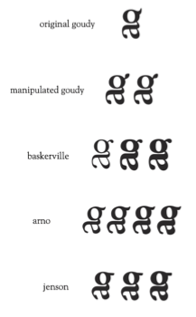
totally full-on working with the idea of meltiness rather than brittleness, i leaned more and more towards big, round, bold, drippy designs. both matthew and marty helped me determine that the rightmost baskerville was the most effective. (bewilderingly it called itself semibold while appearing optically bolder or at least as bold as the bold to its left?)
this of course is that:

i'm really pleased with it. it's unified as a single letter-form while at the same time comprising two separate letters, which i think are both still legible. bonus points: the first letter of the symbol is successfully dominant, without any confusion.
Tuesday, October 19, 2010
blog identity!
i've been building clockwork vector birds, you might notice.
my color theme is the simplest set of shades there is: greys into black, with a light cyan-ish accent.
i liked the diagonal stripes that the template i most recently put on used, but i wanted to try to put some birds in the background, so i rebuilt it. i can't really tell right now how the diagonal lines are working, because they look so different between zooming in on illustrator, or zooming out on illustrator, or in blogger with a bigger or smaller window. i need to check on more computers, i think. because it shouldn't be tiling at all, i saw how that looked and instead built a big enough striped rectangle to take care of at least the "above the fold" part of the blog without needing to stitch together... web is so persnickety! but i am of course learning.
i also made another stylesheet without the background silhouettes, because as much as i love them, i'm not certain how well they work? so just in case, i backed myself up. it's definitely cleaner without them, but in being cleaner it is just a little... less... all the way around. maybe in a good way? i'm looking forward to getting some opinions. so, here's the simple background:

anyway, i love birds!
my color theme is the simplest set of shades there is: greys into black, with a light cyan-ish accent.
i liked the diagonal stripes that the template i most recently put on used, but i wanted to try to put some birds in the background, so i rebuilt it. i can't really tell right now how the diagonal lines are working, because they look so different between zooming in on illustrator, or zooming out on illustrator, or in blogger with a bigger or smaller window. i need to check on more computers, i think. because it shouldn't be tiling at all, i saw how that looked and instead built a big enough striped rectangle to take care of at least the "above the fold" part of the blog without needing to stitch together... web is so persnickety! but i am of course learning.

i also made another stylesheet without the background silhouettes, because as much as i love them, i'm not certain how well they work? so just in case, i backed myself up. it's definitely cleaner without them, but in being cleaner it is just a little... less... all the way around. maybe in a good way? i'm looking forward to getting some opinions. so, here's the simple background:

anyway, i love birds!
Subscribe to:
Comments (Atom)