Friday, April 8, 2011

stuff that a dj (or wannabe) should know: final infographics!

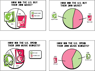
this has been fun. it really has. i'm afraid to say that i like infographics, because that sounds like i think i'm good at them, when i've only just begun, but... this process has been enjoyable, and i imagine that infographics could be a thing i can get good at someday.

my research was a bit eclectic given that there's no grand dj census, but i think that made it more fun. instead of telling people about the dj population, i got to use my research to find interesting, related information that could be educational for both djs themselves as well as people interested in their history and tools. my icons often stood in for the artifacts they represented, but they also stood in for things like live & recorded music and digital & physical albums, as well as loudness/softness. i spent a lot of time trying to get my graphics to hold the same amount of white vs. color as one another. i've also pared down a lot of extra visual information like year-marks and unnecessary boxes, a choice that opens my graphics up a lot more, keeping them from looking too blocky. but now... i'm excited to move forward and put them into a magazine!


Thursday, April 7, 2011

final o'connor ebook covers!

so here are my watercolored animals/objects in the context of book covers, seen embedded in the context of screen grabs of real ebookstores!


Wednesday, April 6, 2011

flannery o'connor

so! i haven't talked about this yet. my bad, blogosphere. here's the story so far.

over spring break we read a set of short stories by either faulkner, o'connor, or poe. i chose o'connor, as she was the only one i hadn't read previously. the project is to make a related set of 3 e-book covers, one for each story, the sort that you might buy from itunes(?) or wherever it is that fine e-books are sold. this means that our covers will remain in a digital format and operate from thumbnail up to screen-sized.

we started by coming up with 5 different directions, each with a cover for each story. in case you can't read my inarticulate handwriting, or for the occasions i didn't write my explanation, they are as follows:

"the innocent identifiables of the bad guys." i've got a couple of ideas here (almost all of them, actually) that deal with the naïveté of the main characters by misrepresenting the bad guys as harmless or even good/helpful.


this idea deals with choosing animals to work as symbols for the main antagonists.


"a misleading image from RIGHT BEFORE the betrayals." this would take something that looks nice, romantic, sweet pleasant good etc, that once you've read the story you would understand to be dramatically ironic.

"the moment they first see the traitor," from the point of view of the characters. another mislead/dramatic irony solution.


this one has more to do with my reading of what the project was about, compositing and manipulating imagery... i thought of combining the faces of all the different characters of each story into one bizarre multi-face. not the strongest idea.


so, from there, it was revealed to me through critique that the ideas people found most interesting were the animals as symbols, and maybe the innocent objects, if i could combine the two? (i could.) i also thought harder about my animal symbols, choosing the fox for the trickery of the bible salesman in good country people, a snake for the psychopathic tendencies of the misfit in a good man is hard to find and a vulture to represent the scavenging/leeching of the handyman for the life you save may be your own.


the other option my classmates found most interesting was the "moment before" idea, with the twist that maybe it came from the point of view of the bad guy.  i was a little less excited about these.


the next step was a stage one digital trial. instead of 3 related covers, i decided to use each cover as a way to explore a different rendering method for my animals/objects idea. the type is digital in all three, but for the image, i tried all analog (watercolor), analog/digital combo (watercolor+vector) and all digital (vector). it shouldn't be too hard to discern which is which.


in a turn that honestly surprised me a little (but not too much), everybody preferred the pure analog approach to imagery.

what this means is that in my next super awesome blog post on this topic, you'll see at least two new watercolored animal/stuff pictures!

final bantjes poster & postcards


marty was pretty pleased with out class's work, all up on the wall, which is awesome, and always a good feeling. she said it was "sophistocated for our level," i think. or something similarly humbleflattering (can i coin that word? it has a nice sound to it.) we unanimously need to work on our secondary information, myself very much included. type is a thing where, i think, the simpler something is, the harder it is to actually succeed at. big names and titles and looks are one thing, but the harmonious typesetting of a few lines of backup info, things that need to be said supplementarily but not noisily, is so so so delicately, precisely difficult! earlier in the project, i would've said that that was just me, but after critique, it appears (to at least some degree) to be everybody. it's like the quote patrick used in his campaign: "everything in typography is a subtlety." and how.

my poster design came pretty far this time. i always knew i was interested in the 'by-hand' aspect in marian's work, and i'm glad i got to use a refined version of that idea in my final. i learned in my critique that i could stand to have the pattern in my corners still even smaller, that it turns into a nice gold texture the smaller it gets, and that the beads are nicer as a surprising up-close reveal. (changes for portfolio, ofcourse)

in class we spent some time talking about "the moral of the story," or "what we learned at school today." (sometimes i think we can get some pretty meaningful things out of charmingly childish sounding exercises like storytime and talking about what we learned. i wish more people realized that.) as a response to erica's heightened understanding of simplicity, i added that sometimes, you just don't want simplicity. and at that point, you have to step up to the designerplate, and wrangle some complexity.

ornament is never problematic if it's controlled. something can be visually busy in places and still clear and legible and clean, provided that the wildness and complexity are reined in with a well devised ruleset.

i also described the realization that i'm continually having that this isn't just school anymore. this is it. the real deal. the thing school has been preparing me for. now is the chance to finally do the things i care about doing in the way i want to do them. i get to mold the things that i love and the aesthetic i want to work within into my work to solve the problems my professors set out for me.

marian bantjes is a good person to learn this lesson from. she dropped out from school, and from the mainstream working world, to make the things that she wanted to make, and in doing that with as much passion as she did, she succeeded in getting noticed by people who wanted her obsessive dedication in their work. she does what she wants, and people appreciate it. so they hire her to do it more. this, it seems, is the way to go about it.

thanks marian! i'm kind of sad she's not coming on the 27th.

Sunday, April 3, 2011

infographics

here are my infographics, another step refined. my critique was pretty decent... in the next stage, i'm losing my bubble frame. as for the doubles, the pies on the left were preferable, and the horizontal-oriented decibel chart was the choice. i'm scared to say it, but i think i kind of like infographics?


bantjes

marty helped me settle on the composition i ultimately finished with by folding two options in half to combine them. this necessitated the addition of a second axis for my type, something i hadn't really thought to try up until that point, but i think it helps my composition be less static, to be asymmetrical in such a way that still speaks to symmetry.
this was my last set of iterations, once i had my basic composition figured out. they don't all have real corners because i wanted to do quick type comparisons without bogging down my computer.


double axis revelation:


the other aspect of this lecture-publicity project was a postcard to advertise the event. i tried a few different methods, utilizing my established language in a few different ways.
this last one is my final postcard. i tried to utilize several different alignments in my type to allow for movement, and i strove for contrast between the large and small lines of text for hierarchy and interest.


hopefully monday's critique goes well! i think, looking at my first round of ideas, this has come a long way into something very nice looking, that is informed by marian bantjes's process as well as aesthetic, without crossing the line into mimicry.