Tuesday, May 8, 2012
ux reflection
user experience has been a great class for me because it goes so deep. i really struggle along the surface of design, but i am enthralled by the deep and the broad: the research and the planning. the amount of behind-the-scenes and background work in this class was very rewarding for me, and i feel like i've learned well how to use those methods in my future work. we must never forget that we're not designing in a vacuum, nor are we designing for other designers. we're designing for people, with needs and wants other than simple aesthetics. we're solving problems, and in order to solve problems, we must first identify them, and not only that: we have to see how people are already trying to solve those problems themselves, so that we can move organically into that space and support them, rather than pretending we can jump in as outsiders and impose our thoughts on other people.
hand built final presentation
adobe design achievement awards entry
this packaging redesign was intended to add some delight to the experience of purchasing a fairly un-delightful product. in order to do that, i generated a character to personify the math kit, and worked to create beautiful typographic relationships. to overcome the limitations of the way the product was packaged to begin with, i ended up prototyping a new structure as well as designing the aesthetic.
the purpose of this project was to redesign a consumer package while presenting it through a different rhetorical mode of appeal. this "geometry math kit" was using a thoroughly uninspiring "logos" appeal and i worked to introduce more "pathos" to the equation.
this work was created entirely of vectors in adobe illustrator for a sharp, geometric feeling even within an illustrative character.
closeknit app presentation
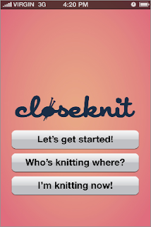
closeknit is designed to help you find and connect with other knitters in your area. whether you’re just looking for a friend or two, a quick meet-up while you’re already out working, or a formally organized circle, closeknit can help you find companions so you can chat, teach, get advice, or anything in between.
Monday, May 7, 2012
closeknit skins
after wireframing the closeknit app for content, it was time to take it into the fitting room with some outfits to see what might be the most flattering. we chose three important and very different screens to try out three aesthetics on. these are the home screen, the "who's knitting where" feed, and a personal profile.
closeknit progress
the final project in information architecture this semester has been the creation of a tailorable iphone application for the culture we spent the early part of the semester researching. that brought me back home to knitting, and the young folks lillie and i had worked with, who use technology in their knitting practice... well, they're a perfect target audience for an iphone app, and i was excited to work on it.
in our interviews, one struggle that came up over and over again was how hard it was to find other people to knit with, and how difficult it was to find, start, or join a knitting circle. knitters love to talk about their work, but if they don't know anybody else who does it, then they have a hard time fulfilling that need! i knew from the start of the term that when i had the opportunity to create an app for knitters, i wanted to help them connect with each other in real life, not just online through sources like ravelry.
the first real step was to flesh out a user scenario through hand-sketched notecard wireframes, which i've done a little like the following.
what occurs is this: a new user opens the app for the first time, and gamely decides to "get started" rather than jumping ahead to the other buttons. they are prompted through a questionnaire to help match them with knitters in their area. the idea is that the app could be used to find individual friends, or to join up with established circles, or to find a collection of people who aren't a circle yet but should be. once our user fills out his information, which includes things like whether he needs help, wants to teach others, or would be more comfortable just hanging out, he is taken to a screen full of search results, based on his gps location. from here, he can view someone's profile, message them through the app, or add them as a buddy. additionally, if a person has chosen to share their phone number with the app, it will also facilitate phone calls and text messages. intrigued by a person named lillie schenk, our user messages her to see if she wants to hang out sometime. she replies that she does! the scenario continues once they're already together, moving through another way to use the app. this time when the user opens the app, he has more options, because he has already started tailoring his experience. he says he's "knitting now!" and is asked a series of questions about his circumstances such as where he is and whom he's with. having filled that out, he can see the live feed of knitters in the area, and view their entry, with the potential to invite other app users directly.
Subscribe to:
Posts (Atom)


