according to thefreedictionary.com, experimentation is defined a handful of ways.
experiment: (noun)
1. A test under controlled conditions that is made to demonstrate a known truth, examine the validity of a hypothesis, or determine the efficacy of something previously untried.
2. An innovative act or procedure.
3. A test or investigation, esp one planned to provide evidence for or against a hypothesis.
4. An attempt at something new or different; an effort to be original.
experiment: (verb)
To try something new, especially in order to gain experience.
i thought it would be helpful to get a dictionary definition of experimentation before getting into peter bil'ak's article, particularly since he begins by defining experimentation as it is used in the design world. when design-industry people use the word experimental, they can really mean any number of things, such as new, unconventional, unexpected, or hard to label. it can also be an awful euphemism for an unsuccessful attempt at a solution, to remove accountability from the designer, who can say, "oh, it was just an experiment," and then, there's no harm done if it doesn't turn out well.
in the scientific world, experiments are done in controlled circumstances to empirically determine the results of carefully orchestrated tests, in order to add to knowledge or work towards proving a hypothesis. by the very nature of art and design, that perfect objectivity is much less attainable, making design experimentation rather harder to define. peter bilak asked lots of designers to help him define it, and got what was presumably a pretty smooth gradient from "everything is experimentation!" to "there's no such thing of experimentation."
a reasonable definition, then, might be that doing something new or unfamiliar is experimental. unfortunately, by this point in history, it's getting harder to do something totally new, so we have to be willing to call something experimental that simply goes against the generally accepted standards of the current scene. another might be the idea of working without having any inclination towards the end results, in which case, by the time something goes all the way to production, it is no longer experimental. how confusing!
bil'ak draws attention, too, to the fact that no matter how experimental something is in its inception, if it is the least bit successful, it will become assimilated into what is okay, and widen those boundaries of acceptability.
for this reason, we will always be straining towards the asymptote of having-tried-everything, and of course never reaching it, but the experimentation may become very subtle, or very game-changing, and all the while, we will become more open to the possibilities. so at each step of the way, something that was once completely unheard of, will become the challenged canon against which the experimenters are struggling.

Saturday, February 5, 2011
Friday, February 4, 2011
cover & mockup book
for my cover, i decided to work with the scratch concept, trying the analog method of wiggling a plain printout of the text on the flatbed scanner. jamie recommended simply centering the text rather than having it inexplicably off to the side, as it was in my first iteration.
here is what i came up with:

i really like how it's not explicit about my culture, but makes perfect sense once you think about it.
in my spreads, i decided to allow myself to use up to two units for a photograph, either vertically or horizontally, but never more. i fit most images into single unit squares.


dj spreads and covers, round 1
we were to choose one of our artifacts and try on 5 different spreads, and 5 different cover possibilities.
these were my 5 covers:
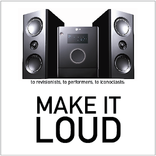


i learned a bit too late that oughtn't have used images of our artifacts on our covers, so my use of speakers, records, and the record player was not so clever. jamie liked the blackout font of "remix", and also the idea of the scratching.
for my layouts, i chose headphones as my artifact to work with, which may or may not have been a good idea, but i ended up with 5 spreads nevertheless. they are as follows!


the first two were eliminated pretty easily. jamie thought the last two, while not terribly successful right off the bat, had good potential. the third one? it was, of course, my favourite. i based it off equalizer bars on sound equipment. but it wasn't working. so i tried, and tried, and it still didn't work. i decided to work with the last layout, based off the 8-grid. two rows, four columns.
these were my 5 covers:


i learned a bit too late that oughtn't have used images of our artifacts on our covers, so my use of speakers, records, and the record player was not so clever. jamie liked the blackout font of "remix", and also the idea of the scratching.
for my layouts, i chose headphones as my artifact to work with, which may or may not have been a good idea, but i ended up with 5 spreads nevertheless. they are as follows!


the first two were eliminated pretty easily. jamie thought the last two, while not terribly successful right off the bat, had good potential. the third one? it was, of course, my favourite. i based it off equalizer bars on sound equipment. but it wasn't working. so i tried, and tried, and it still didn't work. i decided to work with the last layout, based off the 8-grid. two rows, four columns.
Thursday, February 3, 2011
image class identity book
edit: this is how critique went! we all swapped books around the table. erika ended up with mine, and here were some of the things my "pleased to meet you" project evoked from both her and the rest of the class, paraphrased from my notes:
•warmth, especially from the colors and the mood and the personal nature of the pictures.
•humanity, from the handmade type and the intimacy of the photos, taken in their locations.
•friendly, being fun and free-spirited and having a goofy hat.
•clarity, from the short depth of field and its implications.
•wisdom, in a light-hearted, dorky way.
•pattern, from the flowers on the hat and the sparkle of the owl.
•noise, from the background information.
these things are basically spot on!
i elaborated a little bit on how i want to be wise but not presumptuous, so i chose a silly looking little owl, and how trying to fit my whole unfamiliar self into 3 images was horrifying so i chose a simple little sliver and hoped that would tell more about me than anything else. amusingly, nobody ever read anything more into my fedora than "she always wears that," which is not exactly untrue. it's representative of my infatuation with hats, my infatuation with accessorizing, and vintage fashion, and also my infatuation with the owner of its mate, my boyfriend, with whom i trade fedoras whenever i get to see him. but. just as easily, it's an index of me because i wear a fedora a lot. i just thought it might help to elucidate a bit more about why.//
these are images i finally settled on, re-shot, and tidied up, in action.


we missed our critique over a snow day, but we should be having at the very least an abbreviated talk about these tomorrow, at which point i intend on returning to this post and talking about the critique i receive.
Wednesday, February 2, 2011
online type class! pretend these are trimmed out and pinned up at 8x8.
we've been reading about and looking at what is referred to by an awful lot of people as "experimental typography." simply for the purposes of the images i'm about to post, (this is pretty much assuredly inaccurate for other applications) i'm going to define experimental typography as the use of letterforms more for their visual qualities than for their applied meanings. we were given 7 principles to try to express through typographic compositions and encouraged to think of cropping, layering, pattern, scale shifts, soft vs. hard, and weight shifts.
those 7 principles, hopefully illustrated by the following compositions, are:
concentration. (placement of the elements in a design to create a feeling of optical pressure.)

space. (using the cues of size contrast and value change, careful placement of elements to create a feeling of depth on the page.)

texture. (exploring value and repetition to create typographic texture.)

gradation. (progressive value change from light to dark or dark to light that creates a feeling of movement and form.)

anomaly. (dissimilar or irregular element in a composition where similar & regular is prevalent.)

repetition. (repetition of elements to unify a composition.)

direction. (alignment or orientation of elements creates an overall feeling of movement in a predominant direction.)

those 7 principles, hopefully illustrated by the following compositions, are:
concentration. (placement of the elements in a design to create a feeling of optical pressure.)

space. (using the cues of size contrast and value change, careful placement of elements to create a feeling of depth on the page.)


anomaly. (dissimilar or irregular element in a composition where similar & regular is prevalent.)

repetition. (repetition of elements to unify a composition.)

direction. (alignment or orientation of elements creates an overall feeling of movement in a predominant direction.)

Monday, January 31, 2011
design is where science & art break even.
letterpress has a really high learning curve. but once i got in the zone with it, i finished mine and then helped a lot of the rest of my class with theirs! i couldn't let that new knowledge go to waste, and i can't just watch people having a hard time if it's within my powers to help.


my best prints:

the combination of big and little in this composition meant i had to print twice, once for the woodtype and once for the metal. the woodtype never did resolve totally clearly, due to imperfections in their surfaces, but i think that is part of the charm, the vintage aspect of the process, using hundred-year-old letters. the haptic qualities of printing, as it were.

the big text in this composition was not so big that it required wood, thankfully. but centering was an extremely intensive process: it was much harder to get all that text to lock into the chase.
Subscribe to:
Posts (Atom)