
"Elemental" gallium cannot be found in nature, but gallium(III) ionic salt appears in bauxite and zinc ores. Pure gallium can be achieved through smelting and is considered a poor metal because its melting point is such that it will melt in your hand. As a solid, it is very brittle and will break like glass, conchoidally, which means without any natural planes of separation. It expands as it freezes, and joins the likes of silicon and water as its liquid is more dense than its solid. Gallium diffuses into the metal lattice of most other metals, weakening them in a phenomenon known as liquid metal embrittlement. It is light colored and silvery.
Gallium was discovered in 1875 using a spectroscope by Paul Emile Lecoq de Boisbaudran and named after Gallia, latin for France, for his homeland. It had been predicted by Dmitri Mendeleev and termed eka-aluminium. Due to its large liquid temperature range, it can be used in high temperature glass thermometers, and its melting point is a formal reference point in the International Temperature Scale of 1990. Most gallium is obtained as a byproduct of aluminium creation. The most common uses of gallium are in microwave circuitry, and as a semiconductor in the form of gallium arsenide & gallium nitride. Laser diodes made with gallium are blu-ray standard disc readers. It also wets glass and porcelain to make mirrors. Gallium(III) is handled by biological systems as if it were iron(III), and as such, it can be used in pharmaceuticals.
so in my initial sketches, i tried to work with the six typefaces i chose. in both my typeface choices and my sketches, the properties i was most interested in trying to evoke were the brittleness of the solid metal and the low melting point/melt-in-your-hands aspect of gallium. two very different strategies, but i think having two totally different directions gave me more to sketch about.
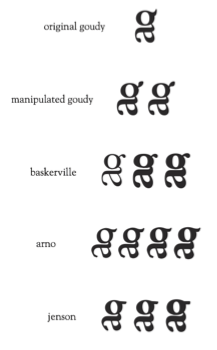
these typefaces:

led to these sketches:

as you can see, a lot of them are based off the idea of melting, running, liquefying, alloying, etc... and a lot of them are based off brittle, tenuous ties between forms that could easily be snapped. i started with the upper/lowercase because that is chemistry standard but wound up enjoying the lowercase set more.
those were group-critiqued by jumper & kyndra, leading refinements & round two:

some melty, some brittle. (i liked that tacked-on one enough to stick it up, even though it didn't make it through the first round. in the amusingly ineffable way of things, that was the monogram form i wound up moving forward with for the rest of the project. i won't lie... it was always my favourite!)
the dots (i seem to have cropped one out in the lowest right corner, but it's there, i promise) are marty's choices for the three-ish i should pursue in sets of iterations, 5 apiece. the connected dots implied that i should strike a compromise between those two compositions.


i placed the one that i felt was strongest in the center position in each set. (devious, right? either everybody mostly agreed with me, or it was some powerful designing...!)
we settled upon the centermost g form (my favourite!) but not before realizing that that bottommost right totally says cat.

(see? totally cat.)
so the next step was to try to resolve the funny pointy horn ear on the g... so i tried out some new fonts.
they looked a little something like this, and inspired me to seriously consider titling my project "gaga for gallium," a title that i still keep coming back to as hilariously appropriate and possible.

which led of course to some more iterating and trying and refining, resulting in the following pyramid of g-s.
totally full-on working with the idea of meltiness rather than brittleness, i leaned more and more towards big, round, bold, drippy designs. both matthew and marty helped me determine that the rightmost baskerville was the most effective. (bewilderingly it called itself semibold while appearing optically bolder or at least as bold as the bold to its left?)
this of course is that:

i'm really pleased with it. it's unified as a single letter-form while at the same time comprising two separate letters, which i think are both still legible. bonus points: the first letter of the symbol is successfully dominant, without any confusion.
No comments:
Post a Comment