iiiit's midterms! monday, we presented an overview of where we were with our projects as well as some rough design comps to get feedback on how we should proceed visually. here is the presentation i gave:
"apart together" scenarios and design by jessirwilson
"apart together" scenarios and design by jessirwilson
and if you'd prefer not to slideshow through the scribd, i have included un-previously-blogged content below to scroll through at your leisure!
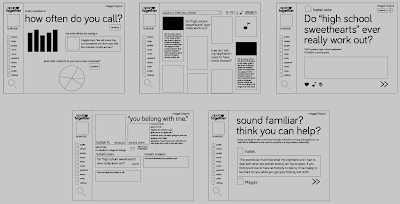
first, wireframes. these first two blocks of five premiered last week, illustrating the process of joining the community, filling out profile information, and asking a question,
followed by another user seeing the question, and—instead of simply answering—viewing the profile and offering to mentor the new user.
the next is a way the site can be used to look for help on a particular topic.
this scenario demonstrates the mood map and how it can be used to find content with the same feeling.
lastly, this scenario shows how the site can be used to help people connect in real life as well as online.
this is a photo-rich visual direction... i have gone back and forth over whether the photos are user-chosen for themselves, or user generated at all, just imagefaded between one another.
this is a much simpler and and more crisp direction that just uses a map collage for the navigation.
after my presentation, everyone agreed that the photo-heavy direction was more interesting and is the design tactic i should be pursuing. now my work is cut out for me in solving the legibility issues and finding ways to make the photography harmonious with the way the site works.


No comments:
Post a Comment