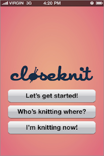
after wireframing the closeknit app for content, it was time to take it into the fitting room with some outfits to see what might be the most flattering. we chose three important and very different screens to try out three aesthetics on. these are the home screen, the "who's knitting where" feed, and a personal profile.


No comments:
Post a Comment