Friday, December 10, 2010
looking back into history with a more critical eye
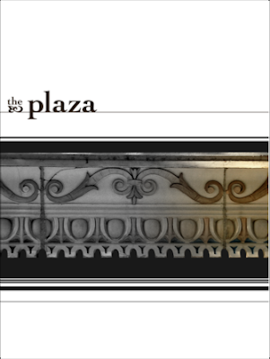
this plaza poster. i feel like i got pretty close, and then swung, and then missed. volleying back and forth on how specific and obvious to make the "spotlighting ornamentation" concept, i struggled to spotlight the plaza the same way i did the valentine. eventually i chose to bring the twin halves of the spotlight between the posters, where they already were utilizing alignment and continuation from the straight lines of the plaza into the zebracurves of the valentine. unfortunately, they were not quite related enough to be a successful diptych, and in demanding that they operate like one, i tied them together too much to be separated or reordered. i remain fond of the typography of this poster, and even the black and white composition, particularly on its own and not compared to my other, but the use of color in this piece was not a very successful experimentation, despite very much iterating and very much colortesting. i would not try to sell this to the plaza. but now i know more! and i'm in the process of knowing more all the time! so everything's just gonna get better and better from here on out.
Labels:
final deliverable,
visual communications i
Subscribe to:
Post Comments (Atom)


No comments:
Post a Comment